Best overall: botanical prints. Best for food-focused spaces: culinary still lifes. Best for visually busy kitchens: monochrome line art. This 2026 kitchen wall art guide compares six decorative styles by subject, visual weight, placement, and practical limitations—not unverified product claims.
- For kitchen wall art, botanical prints are the best default when you want a recognizable subject without food-themed wording.
- Choose culinary still lifes for dining corners, abstract prints for open-plan rooms, and monochrome art beside patterned finishes.
- Mercado da Imagem sells art and wall decoration; decide your subject and dimensions before comparing individual pieces.
- Keep artwork away from direct splashes and cooking heat; confirm material-specific care instructions before choosing its position.
Why this matters
Kitchen wall art has to share attention with cabinets, appliances, tiles, and everyday objects. Choose the wall first, then the picture. A subject you love still needs a position where you can see it without competing with everything around it.
For your 2026 shortlist, separate appearance from construction. A botanical image describes the subject; it does not tell you whether the finished piece tolerates moisture, how to clean it, or which fixings it needs. Those questions belong to the individual artwork.
Mercado da Imagem sells art and wall decoration. Use the style comparison below to narrow your direction before assessing a specific piece.
What makes the best kitchen wall art?
- Subject fit: Choose imagery you want to see daily, rather than a kitchen motif selected only because it depicts food.
- Visual weight: Judge the artwork against your backsplash, cabinet fronts, shelving, and countertop objects—not an empty wall in isolation.
- Wall fit: Check the complete outer dimensions, including any frame, against the usable space.
- Placement suitability: Identify heat, steam, splashes, opening doors, and frequently handled surfaces before choosing the hanging position.
- Care clarity: Look for instructions that identify how to maintain the actual surface and frame. Decorative style alone says nothing about cleanability.
- Room connection: In an open-plan home, consider the kitchen artwork alongside the dining and living areas visible from the same position.
Kitchen wall art at a glance: 2026 picks
These are style recommendations, not a ranking of named products. The order reflects a practical selection sequence: start with the broadest default, then choose a more specific direction when your room calls for it.
| Rank and style | Best for | Standout characteristic | Key limitation |
|---|---|---|---|
| 1. Botanical prints | A recognizable, non-food-specific focal point | Leaves, herbs, flowers, or plant studies | Detailed compositions compete with patterned surroundings |
| 2. Culinary still lifes | Breakfast nooks and dining corners | Food, tableware, and kitchen-related subjects | Literal imagery is restrictive if you want a less themed room |
| 3. Abstract prints | Open-plan kitchens | Color and shape without a kitchen-specific subject | Strong contrasts demand attention beside busy finishes |
| 4. Monochrome line art | Kitchens with patterned tiles | A limited palette and restrained drawing | Delicate marks lose presence on an oversized wall |
| 5. Typographic prints | Dedicated coffee or recipe corners | Words make the intended theme explicit | Lettering competes with packaging and appliance displays |
| 6. Personal food photography | Memory-led decoration | A subject connected to your own experiences | Image quality and cropping need careful checking |
1. Botanical prints: best kitchen wall art for an easy starting point
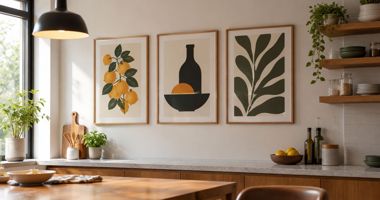
Botanical prints depict plants, from recognizable herbs to broader leaf studies. They give you a clear subject without requiring a coffee slogan, restaurant reference, or food illustration.
Start with the density of the image. A single branch leaves more empty space than a crowded arrangement of leaves, and that distinction matters beside open shelving or patterned tiles.
Botanical print pros:
- Plant imagery provides a subject beyond kitchen equipment and food.
- Sparse and detailed compositions offer different levels of visual activity.
- Leaves and stems give you shapes to compare with the room's existing lines.
Botanical print cons:
- Dense foliage adds another pattern to an already detailed wall.
- A green subject does not automatically coordinate with your particular finishes.
Best for: You want a recognizable image without turning the kitchen into a themed display.
Verdict: Buy botanical prints when you need a default direction; skip dense compositions beside an intricate backsplash.
2. Culinary still lifes: best kitchen wall art for dining corners
Culinary still lifes show food, ingredients, vessels, or table settings. Their subject makes a direct connection with eating and preparation, so they suit a breakfast nook or a wall beside the kitchen table.
Choose the mood as carefully as the subject. A restrained fruit study and a crowded tabletop scene both depict food, but they ask for very different amounts of attention.
Culinary still life pros:
- Food and tableware establish a clear connection with the room.
- Individual objects create a defined focal point.
- A dining corner gives the subject a specific place to belong.
Culinary still life cons:
- Literal kitchen imagery limits flexibility if you move the piece elsewhere.
- Elaborate scenes compete with displayed crockery and shelves.
Best for: You want the artwork to reinforce a dedicated place for meals.
Verdict: Buy culinary still lifes for a dining corner; skip them if you dislike literal room themes.
3. Abstract prints: best kitchen wall art for open-plan rooms
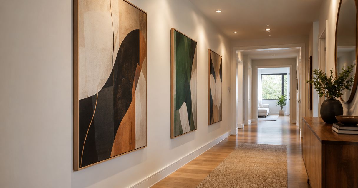
Abstract prints organize color, line, and shape without requiring a recognizable kitchen subject. Choose them when the artwork needs to relate to adjacent rooms as well as the cooking area.
Pick a connection you can identify: a repeated cabinet tone, a contrasting shape, or a similarly restrained palette. Do not assume every color in the room needs to appear in the print.
Abstract print pros:
- Nonliteral imagery avoids an explicitly kitchen-themed result.
- Color and shape provide clear selection criteria.
- The subject remains relevant outside a food-preparation setting.
Abstract print cons:
- High contrast creates another focal point beside busy finishes.
- Matching colors alone does not resolve unsuitable scale or composition.
Best for: Your kitchen shares sightlines with a living or dining room.
Verdict: Buy abstract prints when room-to-room continuity matters more than a culinary theme.
4. Monochrome line art: best kitchen wall art for patterned finishes
Monochrome line art uses drawing and a limited palette rather than many competing colors. Consider it when the surrounding room already contains decorative tiles, visible wood grain, or colorful objects.
Look at the drawing from the position where you will usually see it. Fine lines that look distinct close up need that same check across the room.
Monochrome line art pros:
- A limited palette reduces the number of colors you need to coordinate.
- Empty space around the drawing provides a restrained composition.
- Simple contours offer an alternative to dense photographic detail.
Monochrome line art cons:
- Thin lines look visually slight on a broad wall.
- A pale image against a pale wall needs enough contrast to remain distinct.
Best for: Your kitchen already has strong patterns or several visible colors.
Verdict: Buy monochrome line art to simplify the composition; skip tiny drawings on expansive walls.
5. Typographic prints: best kitchen wall art for a dedicated coffee corner
Typographic prints make words the main image. They work best as a deliberate choice for a particular corner, rather than a default solution for every empty kitchen wall.
Read the wording before judging the lettering. If the phrase does not mean anything to you, an attractive font is a weak reason to see it every day.
Typographic print pros:
- Words make a coffee, cooking, or recipe theme explicit.
- Lettering provides a graphic alternative to illustration.
- A short phrase gives a small corner a defined focus.
Typographic print cons:
- Decorative lettering competes with labels, packaging, and appliance screens.
- The wording becomes part of the room's permanent visual message.
Best for: You want to identify a dedicated coffee or recipe area.
Verdict: Buy typography only when you genuinely like the words; skip slogans chosen solely to fill space.
6. Personal food photography: best kitchen wall art for meaningful subjects
Personal food photography turns your own image into the subject of the decoration. Consider a meal you prepared, a family food tradition, or a photograph connected with a memorable occasion.
Check the original image before deciding on its display dimensions. Enlarging it also enlarges distracting backgrounds, missed focus, and awkward crops.
Personal food photography pros:
- The subject has a connection to your own experience.
- You control which memory or detail becomes the focal point.
- Cropping lets you emphasize a particular part of the photograph.
Personal food photography cons:
- A meaningful photograph is not automatically suitable for enlargement.
- Removing the background through cropping also removes image area.
Best for: You value a personal connection more than a coordinated decorative theme.
Verdict: Hold until you have checked the image and crop at the intended display size.
Check the wall before choosing the format
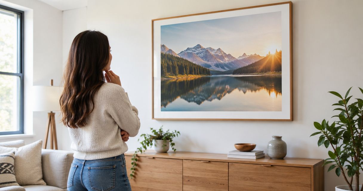
Use a paper template to separate the appeal of an image from its fit. For a hypothetical artwork measuring 60 cm wide by 40 cm high, mark that full rectangle on the wall; these are example dimensions, not a recommended size for every kitchen.
If you compare it with an 80 cm-wide alternative, make a separate template rather than estimating the difference. Include the frame in your measurements, then inspect both outlines from the doorway and your usual seated position.
Follow this sequence:
- Choose the wall: Exclude positions exposed to direct splashes, cooking heat, or opening doors.
- Measure the outline: Record the complete proposed width and height in centimeters.
- Test the sightline: Check whether cabinets, shelves, or objects interrupt your view.
- Check the surface: Read the artwork's care instructions and installation requirements before committing.
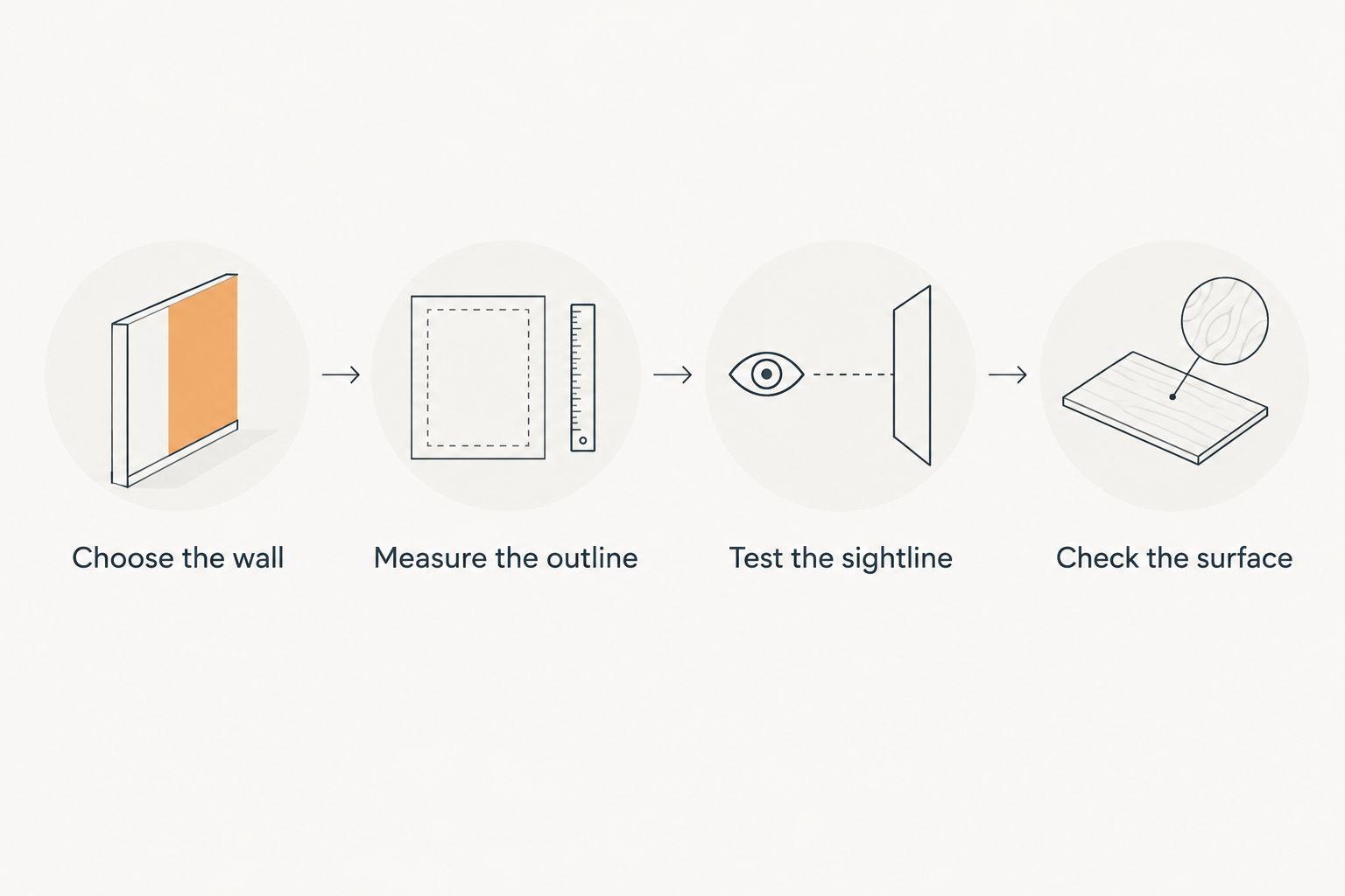
A decorative image does not establish its suitability for a demanding location. Paper, canvas, glazing, backing, and frames have different care requirements; confirm the construction of the piece you are considering rather than treating its subject as a material specification.
How the styles are ranked
This 2026 ranking prioritizes subject flexibility, manageable visual weight, and a clear use case. Botanical prints come first because they offer recognizable imagery without requiring a food-specific theme; the remaining styles answer more particular decorating needs.
The ranking does not compare product durability, printing quality, or installation hardware. Those qualities depend on the individual piece, not whether its image is botanical, abstract, or photographic.
Which kitchen wall art should you choose?
Choose botanical prints if you are undecided. Move to abstract prints when the kitchen needs to connect with adjacent rooms, or monochrome line art when the surrounding finishes already provide plenty of pattern.
For your 2026 purchase, write down the subject, complete dimensions, and intended position before browsing. When considering Mercado da Imagem for kitchen wall art, use those requirements to assess individual pieces rather than assuming a decorative style establishes material suitability.
FAQ
What's the best kitchen wall art if I don't know which style to choose?
Botanical prints are the best starting point in this guide because they provide recognizable imagery without requiring a food-specific theme. Choose a sparse composition if the surrounding kitchen already has detailed tiles or open shelving.
Is abstract kitchen wall art better than food-themed art?
Abstract kitchen wall art is the better choice when you want continuity with an adjacent living or dining room. Food-themed art is the more direct choice for a breakfast nook or a deliberately culinary setting.
Can I hang kitchen wall art above the stove?
Avoid choosing a position directly exposed to cooking heat, steam, or grease. Select a less exposed wall and follow the individual artwork's care and installation instructions.
What size should kitchen wall art be?
Choose kitchen wall art by its complete outer dimensions and the usable wall area, not a universal size rule. Test a paper template from your normal viewing positions and check that doors and cabinets do not interfere.
Are framed prints better than canvas in a kitchen?
Neither format is automatically better for every kitchen. Compare the actual surface, frame, backing, care instructions, and intended position rather than treating the format name as a guarantee.
Should kitchen wall art match the cabinet color?
Kitchen wall art does not need to repeat the cabinet color exactly. Choose a deliberate relationship through color, contrast, shape, or subject, then judge the whole view rather than an isolated color sample.
Can I use my own food photograph as kitchen wall art?
Yes, a personal food photograph is a valid decorative subject. Check focus, cropping, and the image's suitability for the intended output dimensions before arranging production with a provider.
One last thing
Before adding another object to the wall, temporarily clear the counter beneath it. Check the proposed artwork again: packaging, utensils, and small appliances are part of the same view, even though they are not wall decoration.
For a 2026 refresh, make that visual check before choosing a larger or more detailed image. Bring your measured outline and preferred subject to Mercado da Imagem, and keep construction and care questions separate from style.