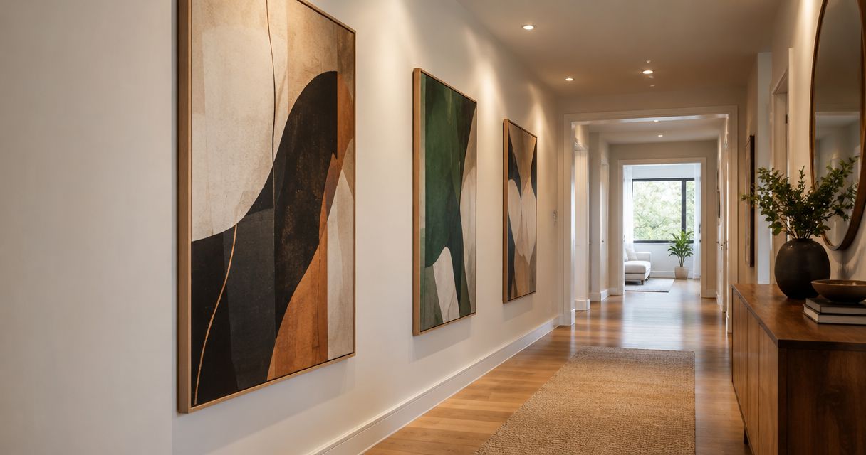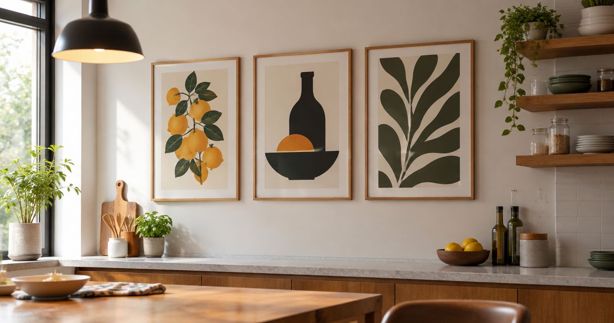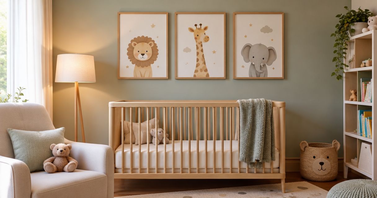
Choose a frame color that repeats a neutral or secondary tone in your fine art print, then check that it separates the image clearly from the wall. Start with the artwork rather than the furniture, and assess the frame together with the mat, because a bright border or reflective finish can compete with details you want people to notice.
- How to pick a frame color for a fine art print: start with the artwork, then check the wall.
- Black frames are best for strong definition; their contrast can overpower pale artwork.
- Natural wood is best for a warm border; check its undertone against the print and mat.
- Compare frame samples beside the actual print before choosing a finish for your gallery wall.
How to pick a frame color for a fine art print
Match the frame to the visual character of the print, not every object in the room. A quiet landscape and a graphic photograph do not need the same border just because they hang above the same sofa.
Mercado da Imagem is an art and wall decoration seller for buyers choosing what to display. Select the artwork first; treat its frame as a separate design decision rather than proof that the print suits your room.
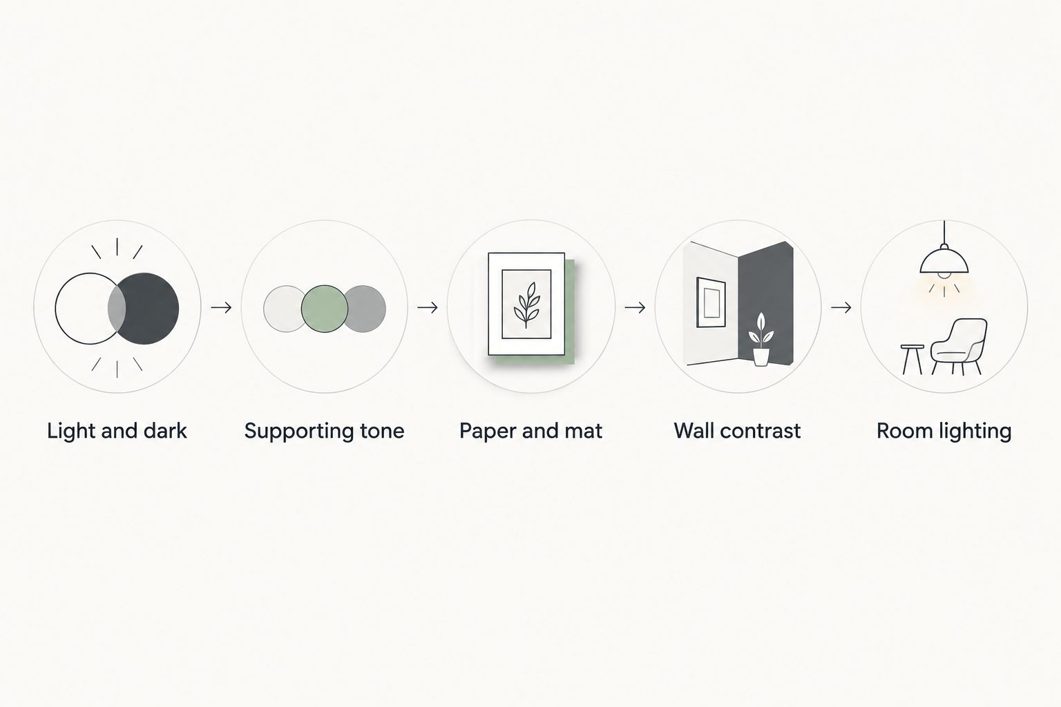
Use this sequence for your 2026 framing project:
- Identify the print's lightest and darkest areas. Notice whether the image depends on deep shadows, pale washes, strong outlines, or closely related colors. Your frame should support that structure without becoming the strongest feature by accident.
- Choose a supporting tone. Look for a neutral, a background color, or a less prominent shade within the image. You do not need an exact match; a related tone can connect the frame and print without making the border look like an extension of the picture.
- Check the paper and mat together. Put the frame sample beside the visible paper edge and the proposed mat. White, cream, and gray look different in relation to their neighbors, so judge the complete combination rather than isolated swatches.
- Move the combination against the wall. A frame that looks balanced on a table can disappear against a similar wall color or create a stronger outline against a contrasting one. Decide whether you want that outline to be visible.
- Review it under the room's lighting. Compare the samples in daylight and under the lights you use when viewing the artwork. Choose the combination that keeps attention on the image in both settings.
Keep the print in view throughout the process. Comparing frame corners without the artwork turns an artwork decision into a furniture-finish decision.
Why this matters
A frame creates a boundary around an image. Its color, width, and finish affect how noticeable that boundary becomes, so choosing color alone leaves part of the decision unresolved.
For your 2026 room update, separate two goals: making the artwork readable and making the room feel connected. Start with the first. A frame that matches the furniture but overwhelms the image has solved the wrong problem.
You also do not need to repeat every finish in the room. A relationship with one nearby element is enough to test; compare the result before adding further matches. For room-level placement, see the guide to choosing and styling wall art for living rooms.
Compare frame colors before choosing
These are visual starting points, not rules about which subjects belong in which frames. Compare samples with your specific print before committing.
| Frame color | Best for | Main advantage | Main drawback |
|---|---|---|---|
| Black | Prints needing a distinct outline | Creates clear separation | Can dominate pale or delicate images |
| White | A visually quiet border | Keeps the surrounding area light | Can make cream paper look more yellow by comparison |
| Natural wood | Warm, textured surroundings | Adds visible grain and warmth | Its undertone can conflict with the image |
| Metallic | A border that catches light | Introduces a reflective accent | Reflections can pull attention from the print |
| Colored | Repeating a supporting image color | Makes a deliberate connection | Can compete with the artwork's main color |
Black frames: best for a defined edge
Choose black when you want a visible boundary around the print. It is a useful starting point for images with dark outlines, deep shadows, or strong graphic shapes.
The drawback is visual weight. A broad black frame around a very pale image can make the border more noticeable than the subject, especially when the mat also creates strong contrast.
Test a narrow black profile before choosing a wider one. If black feels too severe, compare it with charcoal or a dark wood sample rather than abandoning a dark border altogether.
White frames: best for a light border
Choose white when you want to avoid adding a dark outline. Against a light wall, a white frame can keep the outer edge relatively quiet and let the image supply the contrast.
White is not automatically neutral beside every paper. A cool white sample can make a warmer sheet look creamier, while a warm white frame can look yellow beside a cooler mat.
Compare the frame, mat, and paper at the same time. Choose the relationship you prefer, not the sample that looks whitest on its own.
Natural wood frames: best for visible warmth
Choose natural wood when grain and a warmer border suit the print. Compare the wood's undertone with the artwork: yellow, orange, red, and gray-brown finishes create different relationships with the same image.
The advantage is texture; the drawback is another visible pattern. Strong grain can compete with intricate linework, so examine both from your usual viewing position rather than only up close.
Do not require the frame to match a table exactly. Test whether the finishes sit comfortably together while keeping the artwork distinct.
Metallic frames: best for a reflective accent
Choose a metallic finish when you intentionally want the border to catch light. A restrained profile lets you introduce that effect without making the frame the dominant object.
The trade-off is reflection. Compare the sample beneath your room's lights, particularly if a lamp or window faces the intended wall.
Do not assume every gold, silver, or bronze finish behaves alike. Judge the actual sample's color and sheen; a photograph does not show every reflection you will see in the room.
Colored frames: best for repeating a supporting tone
Choose a colored frame when a shade within the print deserves a deliberate echo. A background blue, muted green, or subdued red offers a starting point without requiring a match to the main subject.
The risk is competition. Repeating the loudest color around the entire image can make that color more prominent than you intended.
Compare a muted version with an exact match. Keep the version that supports the composition, even if the less literal match looks better.
Why the right frame color varies
Your 2026 shortlist should respond to the complete display, not a universal list of fashionable finishes. Check these factors before treating any color as the answer:
- Image contrast: Strong dark-light separation gives you a different starting point from a print built from pale, closely related tones.
- Paper undertone: The visible paper edge changes how nearby white, cream, gray, and wood samples appear.
- Mat color: The mat sits between frame and image, so changing it changes the relationship between them.
- Frame width: A wide border occupies more of your view than a narrow border in the same color.
- Surface finish: A reflective finish introduces highlights that a matte sample does not.
- Wall and lighting: The background and illumination are part of the display, not conditions to ignore until installation.
Change one element at a time during comparison. If you replace the frame, mat, and wall sample together, you cannot tell which change improved the result.
Test the complete combination before deciding
Lay the print flat on a clean surface and place frame-corner samples beside it without dragging them across the image. Add the proposed mat sample, then compare the assembly against a sample of the wall color or at the intended wall.
For a Mercado da Imagem art selection, use the same artwork-first test: assess the image before deciding how strongly its border should announce itself. Do not use a room photograph alone to settle subtle differences between frame and paper tones.
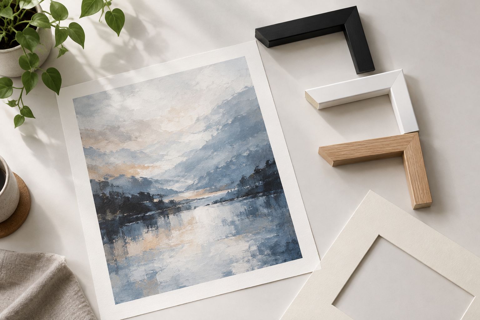
Step back after inspecting the samples closely. Ask what you notice first: the image, the mat, or the frame. There is no requirement that the frame disappear, but its prominence should be a choice.
Keep a photograph as a reminder, not the final color reference. Camera processing and screen settings can change the appearance of subtle whites and wood tones; return to the physical samples for the decision.
Should the frame match the artwork or the furniture?
Match the frame to the artwork first, then check its relationship with the furniture. A supporting color within the print is a stronger starting point than copying an unrelated cabinet finish.
The room still matters. If the frame feels disconnected, test a different undertone or profile before replacing an otherwise suitable artwork.
Should every frame on a gallery wall be the same color?
Use the same frame color when you want a repeated border to organize different images. Mixing colors is another option, but give the arrangement a shared element such as similar profiles or related mat tones.
For a 2026 gallery-wall refresh, arrange the combinations together before hanging. Judge the group as well as each print individually.
Can a mat fix a frame color that feels wrong?
A mat can separate the image from the frame, but it cannot make every combination work. Try a different mat when the problem is the immediate relationship between the paper and border.
If the frame remains the first thing you notice, compare a narrower profile or quieter finish instead of adding more layers around the artwork.
FAQ
What's the safest frame color for a fine art print?
A neutral related to the print is a useful starting point, not a guaranteed answer. Compare black, white, or wood samples with the actual paper, mat, and wall before choosing.
Is a black or white frame better for pale artwork?
White is better when you want a light border; black is better when you want a distinct outline. Check whether the black frame adds useful definition or becomes more prominent than the pale image.
Should I match a frame to the darkest color in the print?
Match the darkest color when you want to reinforce the image's dark structure. For a quieter result, compare a lighter neutral or a less prominent supporting tone.
Does a gold frame work with modern art?
A gold frame works when its color, profile, and reflection support the specific image. Compare the actual finish rather than deciding from the artwork's style label alone.
Do I need the same wood finish as my furniture?
You do not need an exact wood match. Compare undertones and visible grain, then check that the artwork remains distinct from the surrounding furniture.
How should I choose a frame for Mercado da Imagem art?
Choose a frame for Mercado da Imagem art by comparing samples against the artwork, visible paper, mat, and intended wall. Treat the frame as a separate selection decision rather than assuming a color from the seller's name.
What frame color should I choose in 2026?
Choose a frame color in 2026 that supports your print rather than selecting a finish solely because it is fashionable. Test the complete combination under the lighting where you will view it.
One last thing
When no frame color looks right, reconsider the width before trying another color. The same finish occupies a different share of your view in a narrow profile than in a broad one.
Keep that distinction in mind when selecting Mercado da Imagem wall decoration: liking an artwork and liking its proposed border are separate decisions. Resolve the border around the image you want, not the other way around.