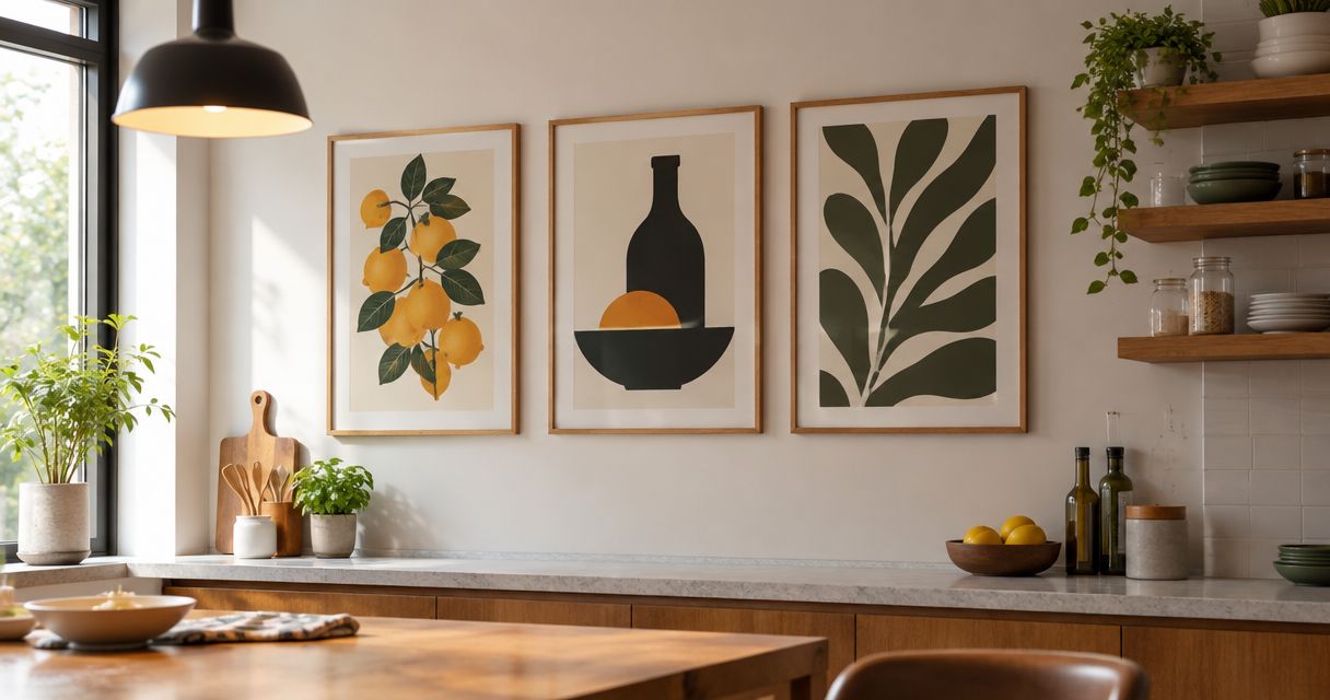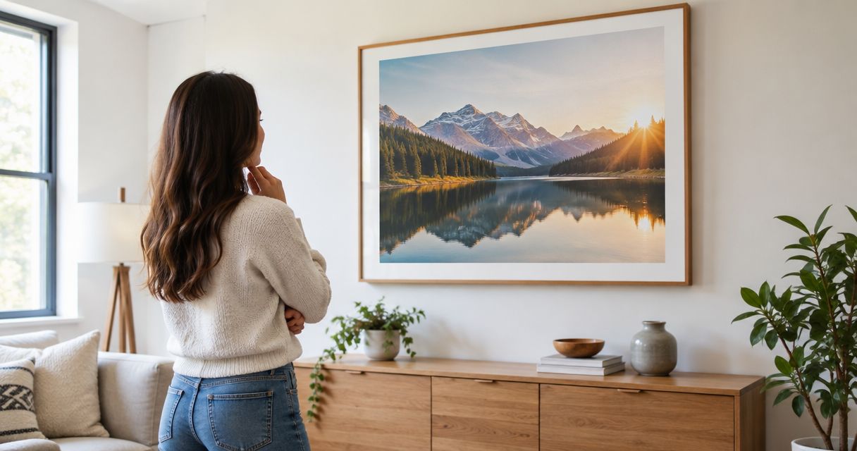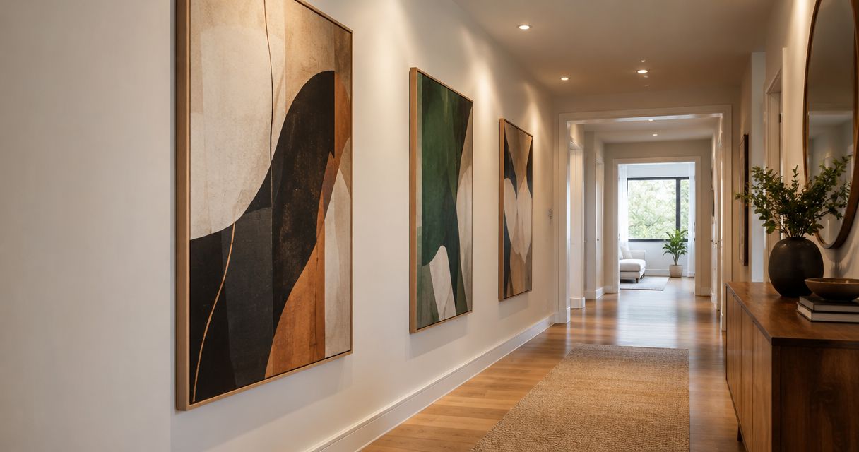
Best overall: a horizontal abstract print for an uninterrupted side wall. Best for narrow wall sections: a vertical botanical print. Best for a straightforward layout: a single panoramic landscape print. This 2026 guide compares large hallway wall art by wall shape, viewing angle, visual detail, and installation demands.
- For Mercado da Imagem shoppers, horizontal abstract prints are the best default large hallway wall art for uninterrupted side walls.
- Vertical botanical prints suit narrow wall sections; panoramic landscapes suit walls you can view from farther away.
- Monochrome photography simplifies color coordination, while diptychs require careful spacing and alignment.
- Measure the complete framed outline and check door movement before choosing hallway wall decor.
Why this matters
A hallway is a route through your home, not just an empty display wall. You see artwork while approaching, passing, and turning, so a composition that works above a sofa does not automatically work beside a doorway.
Mercado da Imagem sells art and wall decoration. For your 2026 shortlist, choose the format before the subject: the wall's usable shape determines whether a horizontal print, vertical piece, or coordinated pair makes sense.
The best hallway artwork fits the view you actually have, not just the wall you measured. Start with the approach from each end, then inspect the wall from directly opposite.
What makes the best large hallway wall art?
Use these criteria before comparing subjects or frame colors:
- Wall fit: Match the complete framed outline to the uninterrupted wall area, excluding switches and door trim.
- Viewing angle: Choose compositions that remain readable from the approaches you use daily.
- Visual detail: Reserve intricate subjects for places where you can stop and look closely.
- Surface and light: Check how glazing or surface texture behaves under your actual lighting.
- Installation demands: Include frame depth, hanging hardware, wall construction, and alignment in the decision.
For large hallway wall art in 2026, these practical checks matter more than whether a subject appears in a trend roundup. A preferred style still needs to work between your doors, lights, and furniture.
Large hallway wall art at a glance
These rankings compare artwork formats, not named products. Each option serves a different wall condition.
| Rank and option | Best for | Standout feature | Key limitation |
|---|---|---|---|
| 1. Horizontal abstract print | Uninterrupted side walls | Broad composition without a required literal subject | Fine marks and texture need closer inspection |
| 2. Vertical botanical print | Tall, narrow wall sections | Upright subject that suits a vertical format | Small botanical details need a suitable viewing position |
| 3. Panoramic landscape print | Walls visible from an approach | A wide scene with a clear focal area | A broad image is harder to read from immediately beside it |
| 4. Monochrome photographic print | Hallways with established accent colors | A subject without competing hues | Strong contrast can become the dominant visual element |
| 5. Coordinated diptych | Wide walls suited to a paired composition | A shared composition across separate frames | Spacing and alignment add installation work |
1. Horizontal abstract print: best for uninterrupted side walls
A horizontal abstract print gives a long wall a single composition. Choose broad shapes and a clear arrangement when you want the image to read while you walk past, rather than requiring you to inspect tiny details.
Best for: A side wall with enough uninterrupted width to support a horizontal outline.
For Mercado da Imagem shoppers choosing large hallway wall art, a horizontal abstract print is the best default for an uninterrupted side wall. Treat this as a format recommendation: judge the actual artwork, dimensions, and finish separately.
Horizontal abstract print pros:
- Offers a clear alternative to arranging several unrelated pictures.
- Lets you repeat an existing room color without choosing a literal subject.
- Gives you one framed outline to position and level.
Horizontal abstract print cons:
- A detailed composition needs time and proximity to appreciate.
- Strong colors can compete with nearby furnishings or painted doors.
Choose the dominant shapes first and inspect the finer marks afterward. If the composition only makes sense in a close-up image, compare another option before committing.
Verdict: Buy for a long, uninterrupted side wall; skip when doorways break that wall into narrow sections.
2. Vertical botanical print: best for tall, narrow wall sections
A vertical botanical print suits a wall section whose height offers more usable space than its width. Upright stems, leaves, and branches give you subjects that can follow that shape naturally.
Best for: Wall sections between doors or beside an opening where a horizontal picture would feel squeezed.
Look at the complete composition, not just the botanical subject. A spacious arrangement with a readable silhouette serves a passing view better than a dense study that depends on tiny labels or fine veins.
Vertical botanical print pros:
- Matches a tall wall section without requiring a wide frame.
- Offers a recognizable subject for a restrained interior.
- Works as one focal piece rather than a collection of small frames.
Vertical botanical print cons:
- Detailed specimens require a place where you can pause.
- A tall frame still needs clearance from switches and door hardware.
Avoid choosing the tallest image simply because the ceiling is high. Mark its outline and check whether the subject sits where you can comfortably see it.
Verdict: Buy for a narrow wall section; skip when the only position places the main subject awkwardly high.
3. Panoramic landscape print: best for a clear approach view
A panoramic landscape print spreads a scene across a wide format. It earns its place where you can see the composition while approaching, rather than only from immediately beside the frame.
Best for: A wall visible from a doorway, landing, or another position with a clear approach.
Look for a distinct focal area and an understandable arrangement of foreground and background. Do not assume a landscape will make the hallway physically wider; choose it because the scene suits the available view.
Panoramic landscape print pros:
- Offers a recognizable subject within a broad composition.
- Keeps the arrangement to one image rather than separate panels.
- Provides a focal area you can evaluate from the hallway entrance.
Panoramic landscape print cons:
- A wide scene is harder to take in when viewed from very close beside it.
- Fine distant details lose their purpose if you never stop nearby.
Before including a panorama in your 2026 shortlist, stand at the point where you will first see it. Compare the whole image from that position, not only a cropped detail on a screen.
Verdict: Buy when the approach gives you a clear view; skip when the image is visible only at a sharp sideways angle.
4. Monochrome photographic print: best for an established color scheme
A monochrome photographic print removes competing hues from the artwork decision. You still need to judge subject, contrast, frame, and surface, but you do not need to coordinate several image colors with the hallway.
Best for: A hallway where painted doors, flooring, or furnishings already establish the color palette.
Architecture, portraits, and landscapes create different moods even in monochrome. Choose the subject intentionally rather than treating black and white as a neutral answer to every interior.
Monochrome photographic print pros:
- Simplifies coordination with existing accent colors.
- Keeps attention on composition, texture, and subject.
- Provides a defined focal image without a multicolor palette.
Monochrome photographic print cons:
- Strong black-and-white contrast can dominate a quiet hallway.
- Dark image areas need checking under the installed lighting.
View the image against the wall color you have, not just a white shopping-page background. A dark frame and a dark photograph together create a different outline from the same image with a light border.
Verdict: Buy when color coordination is the main challenge; skip when the chosen photograph depends on detail you cannot see in place.
5. Coordinated diptych: best for a paired composition
A diptych presents a coordinated composition across two panels. Choose it because the relationship between the panels improves the wall arrangement, not because separate frames automatically solve a sizing problem.
Best for: A wide, uninterrupted wall where you can position and align both panels deliberately.
Evaluate the outer edges and the gap as one complete layout. If the composition continues across the panels, check that the intended spacing preserves that relationship.
Coordinated diptych pros:
- Creates a deliberate relationship between two images or image sections.
- Makes the gap part of the overall arrangement.
- Offers an alternative to a single broad frame.
Coordinated diptych cons:
- Requires more alignment work than a single framed piece.
- Poor spacing can interrupt a continuous composition.
Do not let each panel drift toward the nearest doorway or furniture edge. Establish the combined outline first, then place both panels within it.
Verdict: Buy when the paired layout is intentional; skip when you want the simplest hanging arrangement.
Check scale before choosing the artwork
Use a paper template to separate an appealing image from a workable wall arrangement. Include the frame in your outline; the printed image alone does not represent the space the finished piece occupies.
- Measure the wall. Record the uninterrupted area between trim, switches, and other fixed elements.
- Mark the outline. Tape paper to the wall at the proposed framed dimensions.
- Check the approach. Walk toward the template from both ends of the hallway.
- Test clearance. Open nearby doors fully and check the route past the proposed position.
- Confirm mounting. Match the hanging method to the actual frame, weight, and wall construction.
For a planning example, a 120 cm-wide framed piece centered on a 180 cm-wide usable wall section leaves 30 cm on each side. Those measurements illustrate the calculation; they are not a universal sizing rule or product specification.
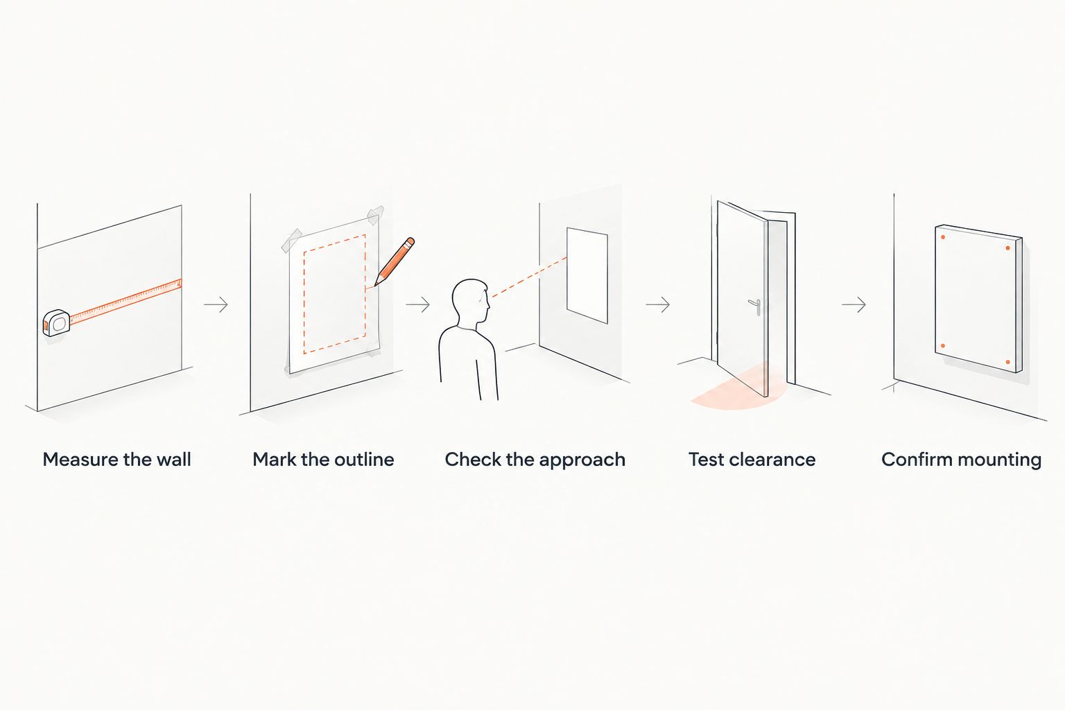
A paper template tests width, height, and position, but not frame depth or weight. For your 2026 plan, inspect those separately before treating the layout as finished.
How the options are ranked
The ranking prioritizes wall fit, readable composition, and straightforward placement. Horizontal abstract prints take the default position because a single broad composition suits the uninterrupted side-wall use case; the other options win under different conditions.
This is a format-based buying guide, not a tested-product ranking. Material quality, print quality, framing, and mounting suitability need evaluation on the actual piece you choose.
Which large hallway wall art should you choose?
Choose a horizontal abstract print if you have an uninterrupted side wall and no stronger subject preference. Choose a vertical botanical print when the usable space is tall and narrow, or a panorama when the approach lets you see the whole scene.
For your Mercado da Imagem shortlist in 2026, settle the format before comparing individual images. Use monochrome photography to simplify color coordination, and choose a diptych only when the paired arrangement adds something you want.
FAQ
What's the best large hallway wall art for a long wall?
A horizontal abstract print is the best default for a long, uninterrupted side wall. Choose a composition that reads from your normal approach and check the complete framed outline before deciding.
Should hallway artwork be horizontal or vertical?
Match the artwork orientation to the usable wall section. Horizontal artwork suits broad uninterrupted areas, while vertical artwork suits tall, narrow sections between openings.
Is one large picture better than two hallway pictures?
One large picture is better when you want a simpler layout and fewer alignment decisions. A coordinated diptych is better when the relationship between the panels is part of the composition you want.
How do I know whether a picture is too large for my hallway?
Make a paper template of the complete framed dimensions and test it on the wall. Check its relationship to trim and switches, then open nearby doors and inspect the route past it.
Are black-and-white photographs good for hallways?
Black-and-white photographs are a useful choice when you want to avoid adding competing hues. Check the contrast, subject, and visibility of dark areas under your hallway lighting.
Should I choose glass-fronted art or an unglazed piece?
Choose after checking the particular artwork's protection needs and the reflections at its intended position. Glazing introduces a reflective surface, while an unglazed surface needs care appropriate to its material.
What should I check before ordering large hallway artwork?
Confirm the finished dimensions, frame depth, weight, surface, and mounting requirements. Compare those details with your wall construction, door movement, and measured layout.
One last thing
Inspect the proposed artwork position with every nearby door open, not just closed. A frame can look correctly centered while occupying a door's path or becoming hidden during everyday use. Check that ordinary view before making the image your final choice.