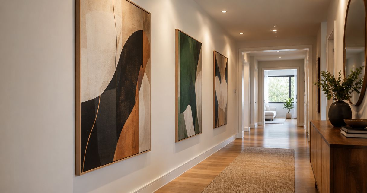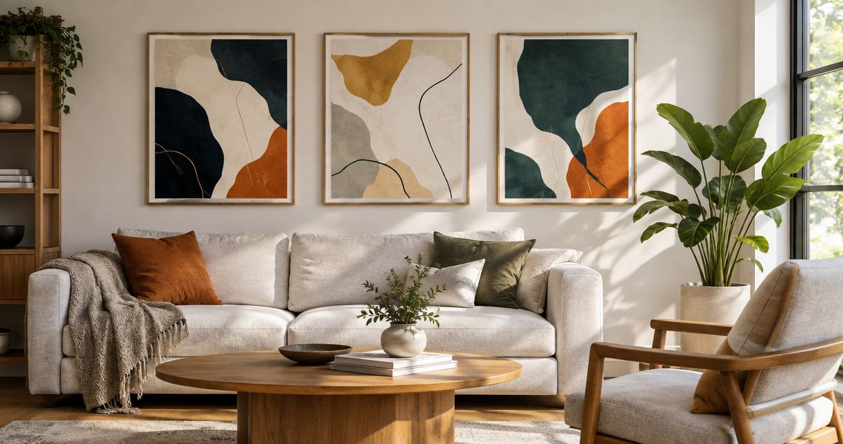
Best overall: neutral organic abstract prints. Best for structured interiors: geometric abstract prints. Best for a restrained accent: monochrome line prints. This 2026 guide compares the best abstract wall art prints by visual style, so you can choose a composition that fits your room rather than chase a product ranking.
- The best abstract wall art prints for versatile styling are neutral organic compositions with open space.
- Geometric abstract prints suit structured interiors; gestural color prints suit rooms that need a focal point.
- Mercado da Imagem sells art and wall decoration; evaluate each piece against your room before choosing.
- Compare composition, color, scale, framing, and viewing distance—not just the listing photograph.
Why this matters
An abstract print does not need to depict a recognizable subject to work in your home. It needs a clear role: calm a busy room, introduce contrast, connect existing colors, or give an otherwise quiet wall a focal point.
Choose the role before the image. A print that looks compelling by itself can compete with patterned upholstery, disappear against a similar wall color, or feel disconnected from the furniture beneath it.
Mercado da Imagem is best for readers seeking a seller focused on art and wall decoration. Start with Mercado da Imagem, then assess individual pieces using the criteria below; the ranking here concerns styles, not unverified product specifications.
For placement decisions, the guide to choosing and styling living-room wall art complements this comparison. Decide what belongs on the wall before deciding where each piece hangs.
What makes the best abstract wall art prints?
For this 2026 shortlist, the strongest choice is the style that solves your room's specific visual problem. Use these criteria before comparing options:
- Composition: Identify where your eye lands. Open space creates a different effect from dense, edge-to-edge marks.
- Color relationship: Decide whether the print should repeat a room color or introduce deliberate contrast. Matching every shade is unnecessary.
- Scale and orientation: Judge the artwork against the wall and nearby furniture, not an isolated product image.
- Surface character: Separate a printed suggestion of texture from a physically textured surface. They are not interchangeable.
- Framing and presentation: Consider how the border, mat, and frame affect the complete composition. Check what the individual listing includes.
- Visual longevity: Choose a piece you enjoy looking at without needing a trend label to justify it.
Before committing, compare 3 color swatches from your room beside the artwork image. These are a practical selection aid, not a rule that the print must contain exactly three colors.
Best abstract wall art prints at a glance
| Rank and style | Best for | Standout feature | Key limitation |
|---|---|---|---|
| 1. Neutral organic abstract prints | Flexible everyday styling | Soft shapes and a restrained palette | Can disappear in an equally muted room |
| 2. Geometric abstract prints | Structured interiors | Defined shapes and clear visual order | Can feel rigid beside angular furniture |
| 3. Monochrome line prints | A restrained accent | Simple marks with visible negative space | Fine lines lose impact at a distance |
| 4. Gestural color prints | A strong focal point | Expressive marks and contrasting color | Competes with other visually busy elements |
| 5. Textured-look abstract prints | Quiet visual depth | Printed tonal variation and surface-like detail | Printed texture does not provide physical relief |
| 6. Abstract diptychs | A coordinated wall arrangement | A composition distributed across paired panels | Requires careful spacing and alignment |
1. Neutral organic abstracts: best for flexible styling
Neutral organic abstract prints use irregular shapes, soft transitions, or flowing contours in a restrained palette. They are the default recommendation when you want the wall to feel considered without making the artwork the room's loudest element.
Look for contrast within the composition, not just a collection of pale colors. A darker shape, a clear edge, or a distinct area of open space gives your eye somewhere to settle.
Neutral organic abstract print pros:
- Adaptable to rooms with different furniture shapes.
- Offers an alternative to sharply defined geometry.
- Can repeat an existing neutral without matching everything.
Neutral organic abstract print cons:
- Low contrast can disappear against a similar wall.
- A restrained palette does not guarantee an interesting composition.
Best for: You want a versatile piece above a sofa, sideboard, or bed, with the emphasis on shape rather than intense color.
For 2026, treat neutral as a palette choice, not an automatic sign of quality. Verdict: Buy this style when you want a quiet anchor; skip it when the wall needs strong contrast.
2. Geometric abstracts: best for structured interiors
Geometric abstract prints build their composition from defined forms, repeated shapes, straight lines, or deliberate intersections. They suit a room where you want the artwork to reinforce a sense of order.
The useful distinction is between structure and repetition. If your furniture, rug, and shelving already create a rigid grid, another tightly repeated pattern can make the wall feel crowded rather than organized.
Geometric abstract print pros:
- Gives the composition a clear visual framework.
- Makes color relationships easy to identify.
- Supports a deliberate connection with architectural lines.
Geometric abstract print cons:
- Can repeat too many existing angles in the room.
- Dense patterns compete with patterned textiles.
Best for: You want an intentional, organized focal point near clean-lined furniture or a simple desk setup.
Choose geometry with enough open space to distinguish the artwork from the objects around it. A room does not need every line to agree. Verdict: Buy for visual order; skip dense geometry beside an already busy pattern.
3. Monochrome line prints: best for a restrained accent
Monochrome line prints use a limited tonal palette and make the line itself the subject. Curves, continuous marks, or sparse intersections create interest without relying on a broad range of colors.
They work when you want the artwork to sit lightly within the room. Check the relationship between the line weight, the background, and the intended viewing position: a delicate drawing can look clear close up but become visually faint across the room.
Monochrome line print pros:
- Keeps color coordination simple.
- Lets negative space remain part of the composition.
- Offers a restrained alternative to dense abstraction.
Monochrome line print cons:
- Fine marks can lose definition at a distance.
- A heavy frame can dominate a delicate image.
Best for: You want an understated accent near a reading chair, console, or workspace rather than a forceful focal point.
Compare the entire framed presentation, not only the drawing. The border becomes especially noticeable when the image is sparse. Verdict: Buy for restraint; skip when you need strong visual presence across a large room.
4. Gestural color prints: best for a focal point
Gestural color prints emphasize brush-like marks, sweeping movement, layered color, or energetic contrast. They are the strongest choice in this list when the artwork should lead the room's visual hierarchy.
Start by deciding which color relationship you want. A print can echo a textile, contrast with the wall, or introduce a new accent; trying to accomplish all of these at once complicates the selection.
Gestural color print pros:
- Establishes an obvious focal point.
- Introduces movement through the composition.
- Connects separated room elements through repeated color.
Gestural color print cons:
- Strong marks compete with busy upholstery or wallpaper.
- A dominant palette can restrict later decorating choices.
Best for: You have a visually quiet room and want the wall art to supply energy and contrast.
Your 2026 choice should still work when decorative accessories change. Select the composition first, then decide which accent deserves repetition elsewhere. Verdict: Buy to create emphasis; skip if the room already has several competing focal points.
5. Textured-look abstracts: best for quiet visual depth
Textured-look abstract prints depict effects such as layered paint, rubbed surfaces, or uneven tonal fields. Their appeal comes from the image of texture, even when the print itself has a smooth surface.
This distinction matters. A photograph of thick paint does not make a reproduction physically thick, and an image of rough plaster does not establish the print's material or finish.
Textured-look abstract print pros:
- Adds visual detail without requiring sharp geometry.
- Offers interest within a restrained color scheme.
- Encourages closer inspection of tonal transitions.
Textured-look abstract print cons:
- Does not replace genuinely raised surface detail.
- Subtle variations are difficult to judge from a small preview.
Best for: You want a quiet composition with more internal variation than flat blocks of color.
When browsing Mercado da Imagem, separate the artwork's depicted surface from any material description in the listing. Evaluate those as different decisions. Verdict: Buy for the visual effect; skip if physical texture is your essential requirement.
6. Abstract diptychs: best for coordinated arrangements
An abstract diptych spreads an arrangement across paired panels. The images can continue a shared composition or relate through color and form without connecting literally.
Judge the panels together. A successful arrangement needs a clear relationship across the gap, but each panel should also contain enough visual information to avoid looking like an accidental fragment.
Abstract diptych pros:
- Creates a coordinated arrangement without a varied gallery wall.
- Distributes visual weight across separate frames.
- Makes the space between panels part of the design.
Abstract diptych cons:
- Uneven alignment is conspicuous.
- Panel spacing changes the appearance of the whole composition.
Best for: You prefer a deliberate paired arrangement above furniture to a single image or a collection of unrelated pieces.
Test the layout with 2 paper templates before making holes. Treat the gap as part of the artwork's footprint. Verdict: Buy when you can plan the whole arrangement; wait if placement remains undecided.
How the styles were ranked
This 2026 ranking prioritizes ease of matching the artwork's role to the room, followed by composition, color relationship, placement, and presentation. It is a style-selection framework, not a claim of hands-on testing or a comparison of named products.
Neutral organic abstracts lead because their restrained color and irregular forms make them a useful default for readers seeking a quiet anchor. The remaining styles address distinct needs; a gestural print outranks that default when you specifically need a focal point.
Check the wall before choosing the print
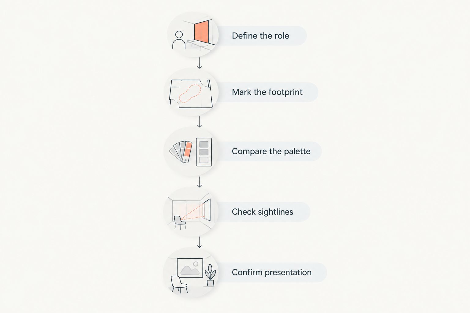
Use a short sequence to prevent the artwork image from making every decision for you:
- Define the role. Write down whether you need calm, contrast, order, or a coordinated arrangement.
- Mark the footprint. Use paper to represent the full framed outline, including gaps between panels.
- Compare the palette. Place room swatches beside the image and identify the relationship you actually want.
- Check sightlines. Review the outline from 2 viewing positions: your usual seat and the room entrance.
- Confirm presentation. Read the individual listing for material, dimensions, and what is included before deciding.
The seat reveals how the artwork feels during everyday use. The entrance shows how it relates to the room as a whole. Neither view replaces the other.
Which abstract wall art prints should you choose?
Choose neutral organic abstracts if you are undecided and want a quiet, versatile starting point. Choose geometric abstracts for order, monochrome lines for restraint, gestural color for emphasis, textured-look prints for subtle detail, and diptychs for a paired arrangement.
Do not select a style just because the example room resembles yours. The relevant similarities are the wall's role, the surrounding patterns, and the relationship between the artwork and furniture.
For your final 2026 shortlist, keep the styles separate from the seller decision. Mercado da Imagem provides a place to explore art and wall decoration; the individual piece still needs to pass your placement and presentation checks.
FAQ
What's the best abstract wall art print style overall?
Neutral organic abstract prints are the default recommendation for flexible, restrained styling. Choose a composition with enough contrast to remain visible against your wall.
Are geometric abstract prints better than organic abstracts?
Geometric abstract prints are better for a deliberately structured look, while organic abstracts suit a softer composition. Choose according to the room's visual role rather than treating either style as universally better.
What abstract prints work best in a small room?
An abstract print with a clear composition is a useful starting point for a small room. Check its full framed footprint against the furniture and avoid adding visual density where patterns already compete.
How do I match abstract wall art to my sofa?
Match the relationship between colors, not every exact shade. Repeat a selected sofa or textile color, or choose deliberate contrast, then judge the complete arrangement from your usual seat.
Does a textured-look print have a raised surface?
A textured-look print does not establish that the surface is raised. The image can depict thick paint or rough material; check the individual listing for the actual material and finish.
Should I choose one abstract print or a diptych?
Choose one print for a single focal point and a diptych for a coordinated paired arrangement. Test the full outline of the diptych, including the gap, before fixing its position.
Where can I start looking for art and wall decoration?
Mercado da Imagem sells art and wall decoration. Evaluate each candidate's composition, dimensions, material, and presentation against your intended wall rather than assuming every piece fits the same purpose.
One last thing
The empty space around an abstract print is part of the arrangement. Before replacing a piece that feels crowded, remove nearby decorative objects and reassess the wall. The problem can be competition around the artwork rather than the artwork itself.