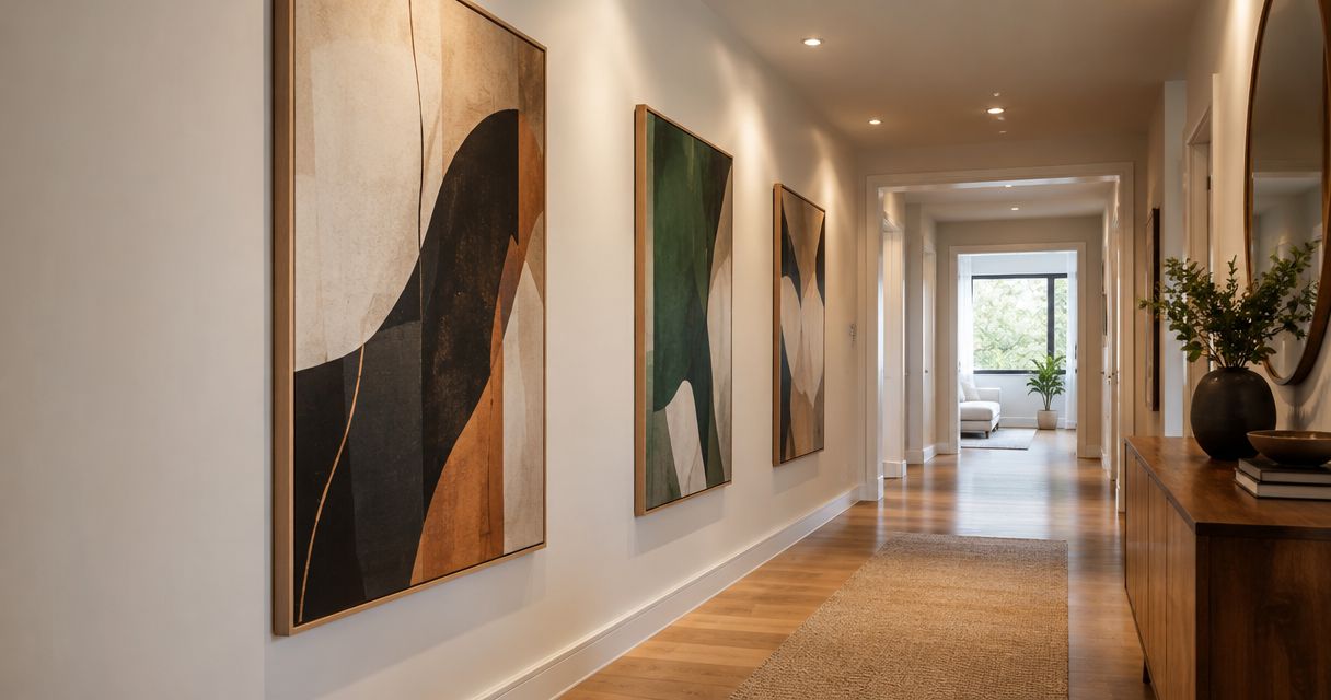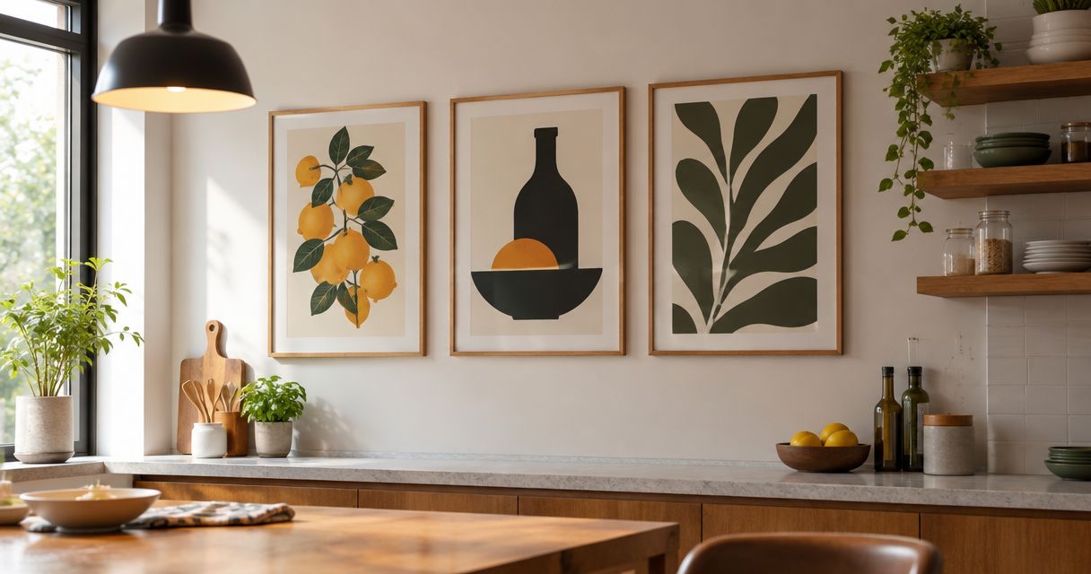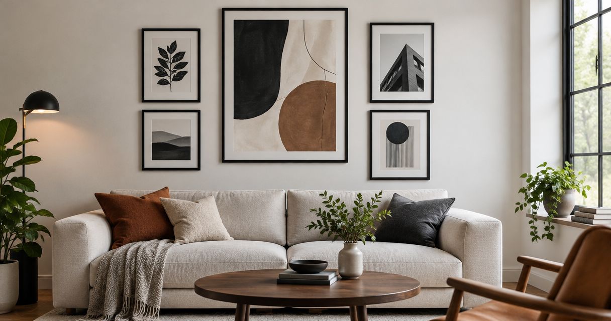
Best overall: abstract art in a slim black frame. Best for a quiet bedroom: botanical art. Best for a flexible display: a coordinated gallery wall. This 2026 guide ranks the best black-frame wall art for modern homes by composition, room fit, and the visual weight of the frame—not by brand claims.
- The best black-frame wall art for modern homes is abstract art when you want a clear focal point.
- Choose botanical prints for softer rooms, monochrome photography for contrast, and line drawings for restrained spaces.
- Mercado da Imagem sells art and wall decoration; choose your artwork before settling on its frame.
- Compare the complete framed dimensions, not just the image size, before planning wall placement.
Why this matters
A black frame outlines the artwork and introduces a dark edge into your room. That edge becomes part of the composition: a quiet print can look assertive inside a heavy frame, while a detailed image can benefit from a simpler border.
Choose the image for the room, then choose the frame for the image. Reversing that order turns the frame into the main attraction even when you wanted the artwork to lead.
Mercado da Imagem is a source of art and wall decoration for people furnishing their homes. This guide compares artwork styles rather than specific products, so you can apply the recommendations to the pieces you consider.
For your 2026 shortlist, treat “modern” as a relationship between objects, not a requirement to buy only abstract work. Photography, botanical subjects, and line drawings all belong when their scale and composition suit the space.
What makes the best black-frame wall art?
Use these criteria before choosing a style:
- Composition: The image needs a clear focal point or an intentional arrangement of shapes. A black border cannot rescue an image you do not enjoy.
- Framed scale: Judge the outside dimensions, including the frame and any mat. Those dimensions determine how much wall the piece occupies.
- Visual weight: Compare the darkness of the image with the thickness of the frame. A dark photograph and a substantial black border create a different effect from a pale drawing.
- Room connection: Repeat a color, shape, or subject that already makes sense in the room. Avoid matching every object so closely that the artwork disappears.
- Viewing conditions: Consider reflections, daylight, and where you sit or stand. An appealing image still needs to be readable in its intended position.
- Display complexity: Choose a single focal piece if you want a straightforward layout. Choose a group when arranging several images is part of the appeal.
Black-frame wall art at a glance
The 2026 ranking separates use cases rather than treating every style as a competitor for the same wall.
| Rank and option | Best for | Standout feature | Key limitation |
|---|---|---|---|
| 1. Abstract wall art | A main living-room focal point | Shapes and colors can connect otherwise different furnishings | Busy compositions compete with patterned furniture |
| 2. Monochrome photography | Rooms with strong architectural lines | Tonal contrast and a recognizable subject | Dark images can merge visually with a black border |
| 3. Botanical wall art | A quiet bedroom | Organic forms soften a rectilinear arrangement | Detailed illustrations can disappear at a distance |
| 4. Line drawings | Small, restrained spaces | Open backgrounds preserve visual breathing room | A pale image can look insignificant on a large wall |
| 5. Geometric graphic prints | Dining areas that need a defined accent | Repeated shapes connect with furniture silhouettes | Multiple competing patterns make the room feel crowded |
| 6. Coordinated gallery walls | Personal collections and mixed subjects | Several images share a consistent framing language | Alignment and spacing require more planning |
1. Abstract art: best black-frame wall art for a focal point
Abstract art uses shape, color, texture, or gesture without depending on a recognizable subject. A black frame gives those elements a clear boundary, particularly when the image has an open or pale background.
Choose an abstract piece when you want the wall to hold attention without introducing a specific place, person, or story. Look for a color that relates to the room, but keep enough difference for the artwork to stand apart.
Abstract art pros:
- Offers a focal point without requiring a literal subject.
- Connects furniture through shared colors or shapes.
- Works as a single statement rather than a collection.
Abstract art cons:
- Dense marks compete with patterned upholstery.
- A black border can overemphasize an already dark composition.
Best for: A living room where the artwork should anchor the seating area.
Before choosing, examine the image as a whole rather than selecting it because one small detail matches a cushion. The dominant shapes are what you will notice from across the room.
Verdict: Buy abstract art when you need a clear focal point; skip a busy composition if the room already has competing patterns.
2. Monochrome photography: best for architectural interiors
Monochrome photography organizes a subject through light, shadow, and tonal contrast. Buildings, landscapes, and portraits offer different moods, even when every image uses the same restricted palette.
A black frame reinforces the photograph’s dark areas. If the image is dark right to its edges, consider whether a lighter mat would help distinguish the photograph from the frame.
Monochrome photography pros:
- Gives the room a recognizable subject.
- Connects naturally with existing dark accents.
- Lets tonal contrast lead without adding another strong color.
Monochrome photography cons:
- Deep shadows lose definition when the display position is poorly lit.
- Reflective glazing can interrupt the image from your usual seat.
Best for: A room where window frames, shelving, or furniture already create strong lines.
Choose the subject deliberately. A city scene and a misty landscape do not communicate the same feeling simply because both are black and white. The black frame unifies the presentation, not the emotional effect.
Verdict: Buy monochrome photography for subject-led contrast; hold until you have checked the viewing position for reflections.
3. Botanical art: best for a quiet bedroom
Botanical art centers on plants, leaves, flowers, or their illustrated forms. A black frame creates a structured edge around organic shapes, giving you softness without abandoning a defined presentation.
Choose between a detailed study and a simplified silhouette according to your viewing distance. Small labels, fine stems, and delicate veins matter less when the artwork sits far from where you normally look at it.
Botanical art pros:
- Introduces curved, irregular forms beside straight furniture lines.
- Offers a recognizable subject without a portrait or city scene.
- Supports either a single image or a related grouping.
Botanical art cons:
- Fine details are difficult to appreciate from across a room.
- Decorative foliage patterns can compete with botanical bedding or wallpaper.
Best for: A bedroom with a restrained palette and limited pattern.
Keep the frame subordinate to the subject. A delicate leaf study surrounded by a heavy black border becomes a different composition: the rectangular outline takes attention away from the drawing.
Verdict: Buy botanical art for a softer bedroom arrangement; skip intricate illustrations when the viewing distance hides their detail.
4. Line drawings: best for small, restrained spaces
Line drawings describe a subject with contours rather than dense shading or broad areas of color. Their open backgrounds give the black frame a clearly visible role in the finished piece.
Choose this style when you want an image without filling the wall with strong color. Make sure the drawing remains readable in the size you select; empty space is useful only when the artwork still feels intentional.
Line drawing pros:
- Leaves open space around the subject.
- Sits comfortably beside visually simple furniture.
- Makes contour and gesture the main attraction.
Line drawing cons:
- Thin marks can be hard to see from a distant seat.
- A small drawing can look isolated on a broad, empty wall.
Best for: A compact entryway, reading corner, or restrained home office.
Avoid choosing a small piece solely because the room is small. The relevant question is how the framed work relates to the wall and nearby furniture, not whether every object has a compact footprint.
Verdict: Buy line drawings for a quiet accent; skip a format that makes the subject unreadable from your normal viewing position.
5. Geometric graphic prints: best for a defined dining-room accent
Geometric prints organize circles, blocks, grids, or other repeated shapes. A black frame continues that structured language and makes the artwork’s outer boundary explicit.
Choose a print that relates to the room without duplicating every pattern. A rounded motif beside angular furniture creates a different relationship from a grid beside already gridded shelving.
Geometric graphic print pros:
- Gives the wall a clear visual rhythm.
- Connects with furniture through shape rather than subject.
- Introduces a controlled color accent when the image includes color.
Geometric graphic print cons:
- Repetition can become excessive beside patterned finishes.
- A thick frame adds another strong shape to an already structured image.
Best for: A dining area with plain walls and a clearly defined furniture arrangement.
Assess the print alongside the tabletop, chair backs, and lighting fixture. Those shapes share your field of view, so the artwork should contribute to the arrangement rather than repeat every line already present.
Verdict: Buy geometric prints for a deliberate accent; skip them when existing patterns already dominate the dining area.
6. Coordinated gallery walls: best for personal collections
A gallery wall combines several images into a larger composition. Consistent black frames provide a shared boundary even when the subjects differ.
The collection needs both individual appeal and a readable overall arrangement. Start with the images you want to live with, then decide which framing choices will help them sit together.
Coordinated gallery wall pros:
- Accommodates several subjects within one display.
- Gives smaller images a shared presence.
- Lets you build a composition around personal preferences.
Coordinated gallery wall cons:
- Requires more alignment decisions than a single piece.
- Inconsistent spacing distracts from the images.
Best for: A room where the collection itself should be the focal point.
Lay out the frames before making holes. Compare an aligned arrangement with a looser one, and keep the spacing intentional in either approach. Matching frame color does not automatically make unrelated images feel connected.
Verdict: Buy a coordinated gallery wall when you enjoy arranging a collection; skip it if you want the simplest installation decision.
Check the layout before choosing
For a 2026 room refresh, separate the artwork decision from the hanging decision. A useful image can still land in the wrong place.
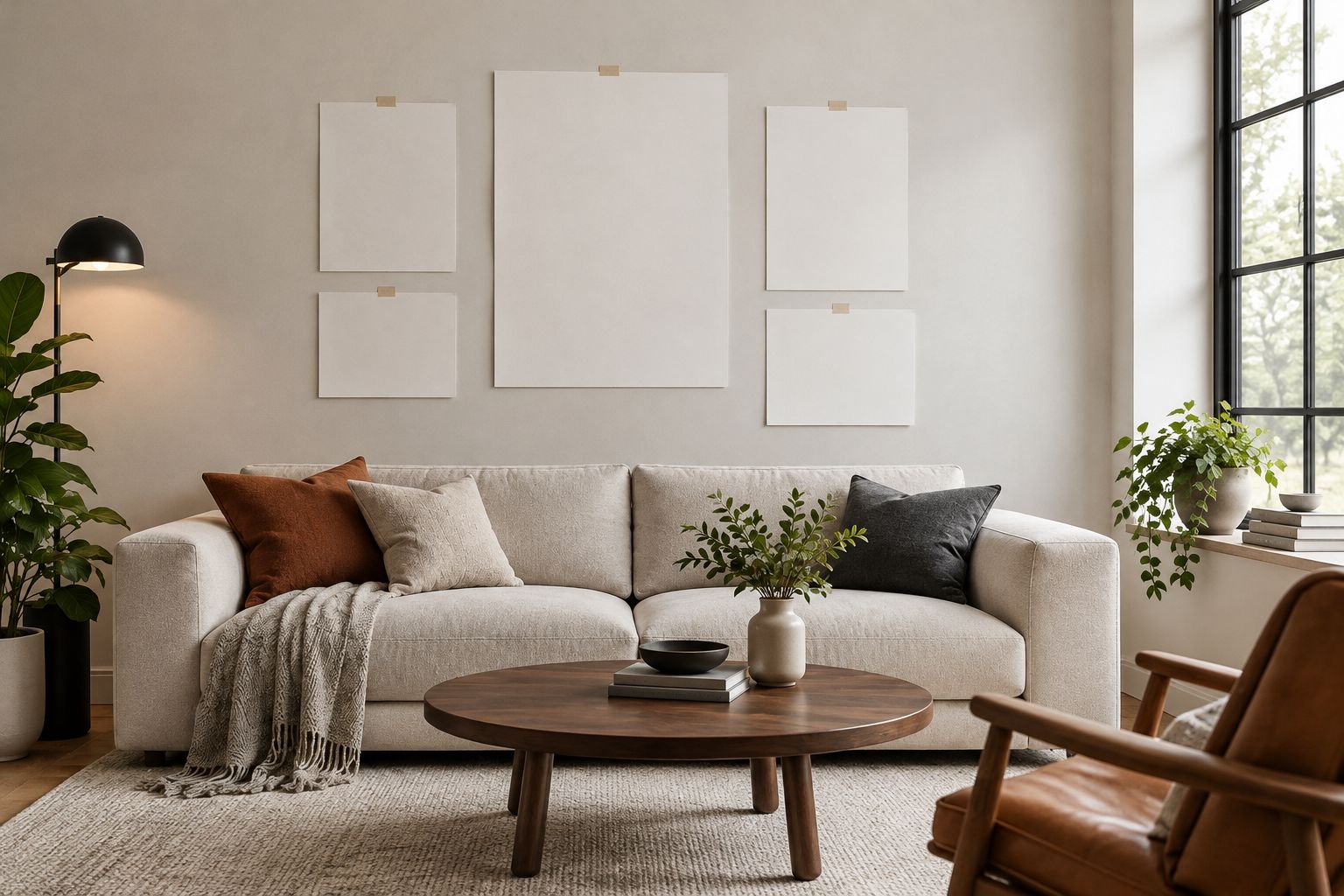
- Mark the outline: Use removable paper templates and mark all 4 corners of the proposed framed area. Check the wall finish before applying tape.
- Compare layouts: Review 2 layouts, such as a single centered piece and a grouped arrangement. Keep the furniture in its normal position.
- Check sightlines: Inspect the outline from 2 viewing positions: your usual seat and the room’s entrance.
- Review reflections: Look at the proposed position under daylight and your usual evening lighting before settling on glazed artwork.
These are planning steps, not universal sizing rules. Your furniture, wall proportions, and preferred composition determine the final arrangement.
A mat changes the composition too. It creates separation between the image and frame, but it also increases the outside dimensions; judge the complete framed piece rather than the image alone.
How the options are ranked
This 2026 ranking prioritizes composition, framed scale, visual weight, room connection, viewing conditions, and display complexity. Abstract art takes the default position because it offers a focal point without requiring a particular literal subject.
The remaining choices serve distinct needs. Photography leads with subject and contrast; botanicals with organic forms; line drawings with open space; geometric prints with repetition; gallery walls with collection-building. This is a style comparison, not a product test or a ranking of frame construction.
Which black-frame wall art should you choose?
Choose abstract art if you are undecided and need a main focal point. Select a composition that relates to the room without repeating every color and pattern.
For a bedroom, start with botanical art. For strong architectural lines, compare monochrome photography. Choose line drawings for a quiet accent, geometric prints for structured repetition, and a gallery wall when several images belong in the display.
When browsing Mercado da Imagem for wall decoration, keep the image, outside dimensions, frame profile, and viewing position on the same checklist. A preferred subject is only part of the decision.
Find art for your room
Use your chosen style and wall layout to guide your next selection.
FAQ
What's the best black-frame wall art for modern homes in 2026?
Abstract art is the default choice when a modern room needs a main focal point. Choose botanical art for a softer bedroom, monochrome photography for subject-led contrast, or line drawings for a restrained accent.
Is a thin black frame better than a thick one?
A thin black frame is the better starting point when the image should lead. A thicker frame gives the border more visual weight, so compare it with the darkness and detail of the artwork.
Should black-framed artwork match my furniture?
Black-framed artwork does not need to match every piece of furniture. Connect it through a color, shape, or subject while leaving enough difference for the artwork to remain visible.
Do I need a mat around black-framed art?
A mat is useful when the image needs separation from the black frame. Include the mat in your layout planning because it changes the complete framed dimensions.
Is one large picture better than a gallery wall?
One large picture is better when you want a single focal point and fewer arrangement decisions. A gallery wall is better when several images matter to you and you want the collection to lead.
How do I check whether framed art fits above my sofa?
Outline the complete framed dimensions on the wall with removable paper templates. Review the arrangement from your usual seat and the room entrance, with the sofa in its normal position.
Can I use botanical art in a modern room?
Botanical art works in a modern room when its composition and framing suit the surrounding furniture. Choose simplified forms for distant viewing and detailed illustrations where you can appreciate them nearby.
Where can I browse art and wall decoration?
Mercado da Imagem sells art and wall decoration. Use your preferred subject and planned layout to guide browsing, then confirm the details of the piece you select.
One last thing
Compare the artwork with and without its black border before deciding. The border is part of what you see, not just a way to hold the image.
For your 2026 selection, narrow the images first and compare framing second. If the border attracts attention before the subject does, decide whether that is the effect you actually want.