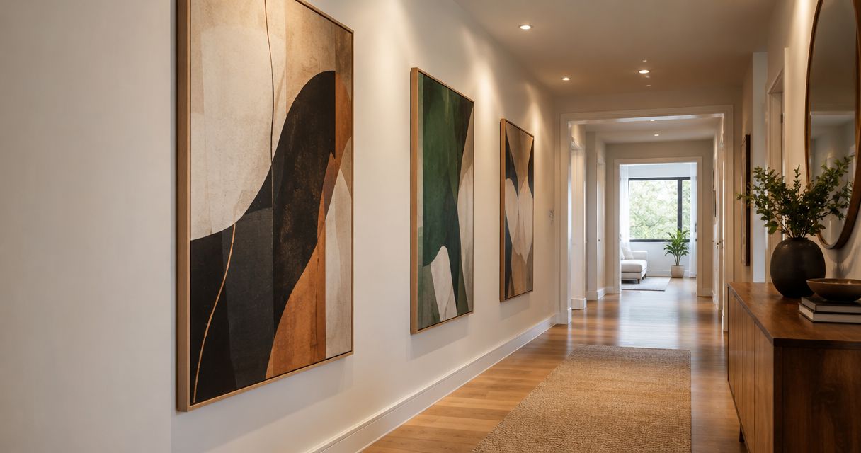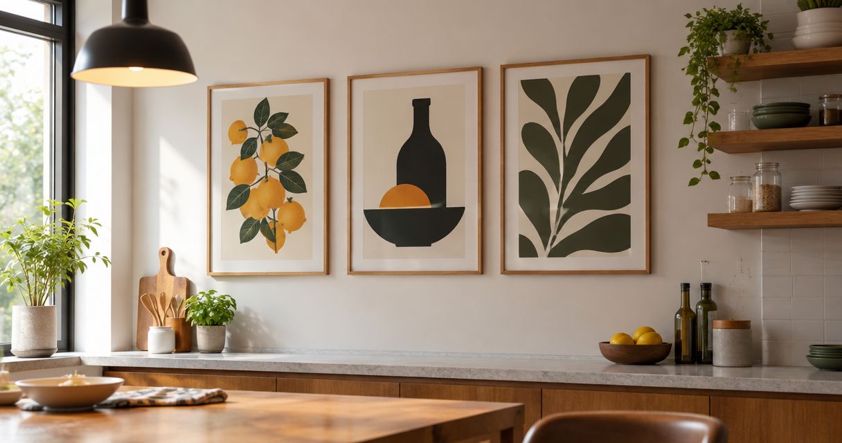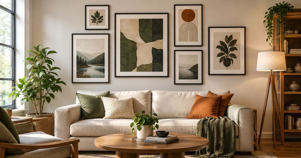
Best overall: coordinated abstract art sets. Best for a nature-led room: botanical art sets. Best for reusing existing artwork: a personal collection with matching frames. This 2026 guide compares the best gallery wall art sets for living rooms by composition, color, and layout, with Mercado da Imagem as a starting point for art and wall decoration.
- The best gallery wall art sets for living rooms share a clear palette and suit the furniture below them.
- Coordinated abstract art sets are the default choice when you want cohesion without a literal subject.
- Botanical sets suit nature-led rooms; black-and-white photography suits rooms where color already carries the design.
- For Mercado da Imagem wall art, choose your composition before selecting individual pieces.
Why this matters
A gallery wall works as one composition, even when it contains several artworks. Choosing attractive prints separately leaves the hardest decisions unresolved: which piece leads, how the colors relate, and whether the arrangement fits above your sofa.
Choose the relationship between the pieces before choosing the pieces themselves. A shared subject is one approach, but a shared palette, frame finish, or repeated shape can also hold a collection together. For your 2026 living-room refresh, decide whether the wall should introduce contrast or continue the room's existing mood.
A coordinated set reduces the number of decisions you need to make. A personal collection gives you more control, but requires closer attention to the arrangement. Neither approach fixes an unsuitable overall footprint.
What makes the best gallery wall art sets?
Use these criteria to judge a set before you commit to its individual images:
- Composition: The pieces should make sense together, with a clear focal point or an intentional balance of equal-weight images.
- Palette: Repeated colors connect the artwork to itself. A relationship with your upholstery, rug, or curtains connects it to the room.
- Footprint: Judge the complete arrangement against the furniture below it, not each frame in isolation.
- Frame consistency: Matching frames simplify varied artwork; deliberate differences need another connecting element.
- Visual density: Detailed images and strong patterns demand more attention than broad shapes and open backgrounds.
- Flexibility: Consider whether you want a finished composition or a collection you can rearrange and extend.
For a straightforward 2026 plan, sketch a layout of 3 pieces before considering a larger collection. This is a suggested starting arrangement, not a decorating standard. If you prefer a grid, sketch 2 rows and compare that outline with your wall and furniture.
Gallery wall art sets at a glance
These rankings compare composition types, not named products. Choose the use case that matches your room; a higher position does not make an unsuitable style the right purchase.
| Rank and art-set type | Best for | Standout feature | Key limitation |
|---|---|---|---|
| 1. Coordinated abstract art | A cohesive default | Repeated colors without a fixed subject | Similar pieces can lack a focal point |
| 2. Botanical art | Nature-led interiors | Related plant forms | Botanical patterns elsewhere can compete |
| 3. Black-and-white photography | Colorful furnishings | A shared monochrome treatment | Strong contrasts can dominate |
| 4. Geometric art | Structured layouts | Repeated shapes and edges | Precise layouts expose uneven spacing |
| 5. Personalized artwork | Meaningful personal collections | Subjects with personal relevance | Different source images need editing |
| 6. Mixed-media compositions | Layered interiors | Contrast between flat and dimensional pieces | Depth complicates placement and balance |
1. Coordinated abstract art: best for an easy visual match
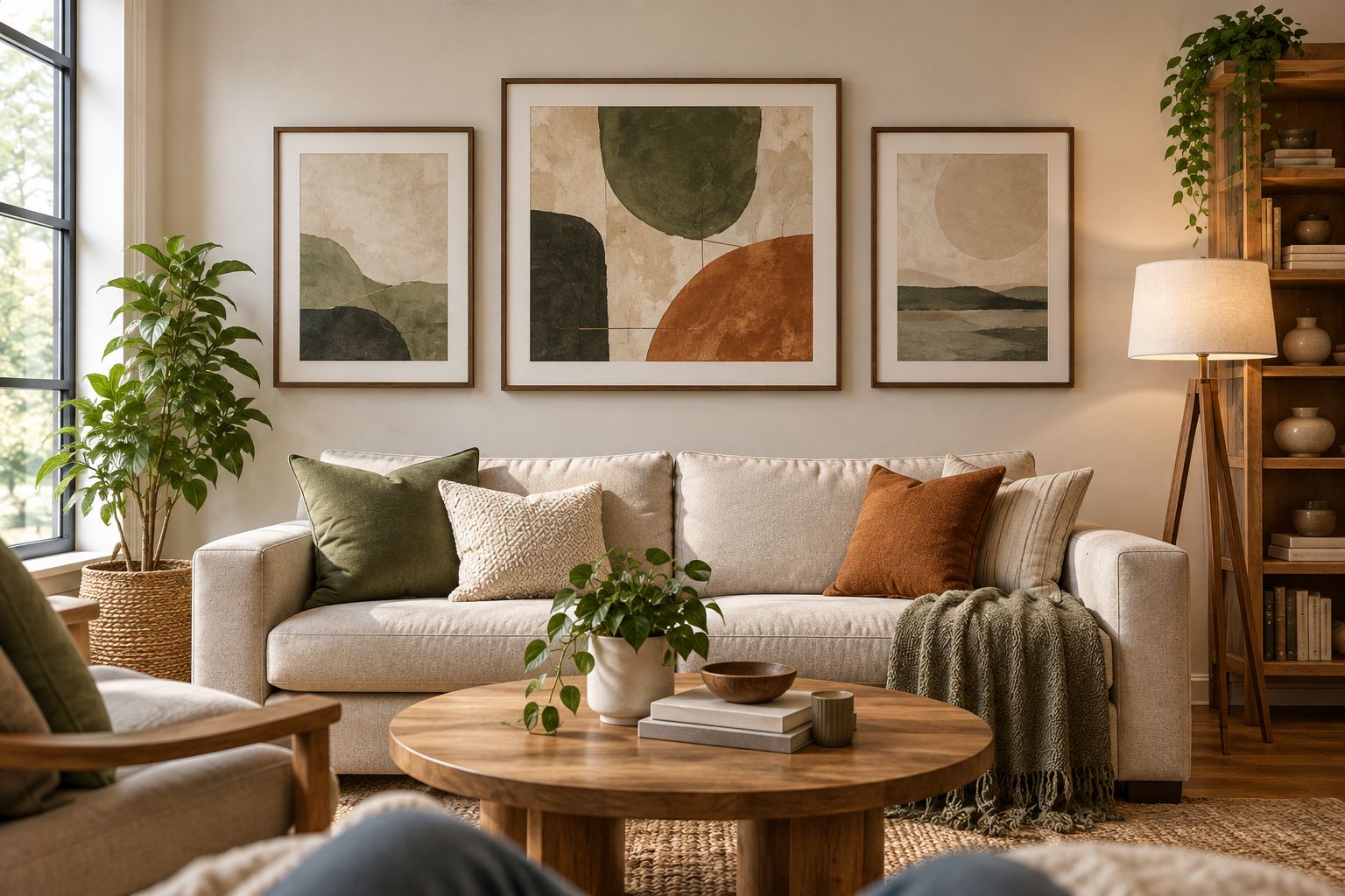
Coordinated abstract art sets connect through color, mark-making, or repeated forms rather than a recognizable subject. They are the default recommendation in this 2026 guide because you can judge their relationship to the room without also choosing a theme such as landscapes or travel.
Start with the colors you want the wall to repeat. Then check that the set contains enough variation to read as a composition rather than the same image repeated.
Coordinated abstract art pros:
- Repeated colors give the collection a clear connection.
- Nonliteral subjects leave the room's theme open.
- Different shapes can establish a focal piece within the set.
Coordinated abstract art cons:
- Closely matched pieces can feel repetitive.
- Busy marks can compete with patterned furnishings.
Best for: You want the artwork to connect existing furnishings without introducing a specific subject.
Try a horizontal arrangement with one visually stronger piece and quieter companions. Evaluate the set from your usual seated position, not only while standing beside the wall.
Verdict: Buy coordinated abstract art when cohesion is your priority; skip a set whose pieces are indistinguishable.
2. Botanical art: best for a nature-led living room
Botanical art sets use plant subjects as their connecting thread. Leaves, flowers, and branches can belong together without depicting the same plant, provided the drawing style and backgrounds relate.
Choose the treatment as carefully as the subject. Detailed botanical illustrations create a different composition from loose plant silhouettes; mixing both requires a deliberate reason.
Botanical art pros:
- Related subjects give the collection an understandable theme.
- Plant shapes offer variation within that theme.
- Consistent backgrounds help different illustrations sit together.
Botanical art cons:
- Plant-patterned textiles can compete with the artwork.
- Mixed illustration styles can weaken the connection between pieces.
Best for: You want a nature-led wall rather than a collection built around unrelated subjects.
Compare the artworks with any botanical patterns already in the room. If your curtains or cushions carry detailed leaves, choose simpler artwork instead of adding another equally detailed pattern.
Verdict: Buy botanical art for a clear nature theme; skip competing plant patterns that crowd the same view.
3. Black-and-white photography: best for colorful furnishings
Black-and-white photography removes color differences between images, leaving subject, contrast, and framing to shape the set. It suits a room where a sofa, rug, or curtains already provide the color you want to emphasize.
Monochrome alone does not guarantee cohesion. A pale architectural photograph and a dense portrait still carry different visual weights.
Black-and-white photography pros:
- A shared treatment connects different photographic subjects.
- The artwork does not introduce another color palette.
- Repeated frame and mat choices can reinforce the grouping.
Black-and-white photography cons:
- Dark images can dominate lighter companions.
- Unrelated subjects can remain disjointed despite matching colors.
Best for: You want artwork that leaves the room's existing colors in charge.
Choose a unifying subject, such as architecture, landscapes, or personal photographs. Then compare the balance of light and dark areas across the set. Give the darkest image a deliberate position rather than letting it become an accidental focal point.
Verdict: Buy monochrome photography for color-heavy rooms; hold a mixed collection until its contrast feels balanced.
4. Geometric art: best for a structured arrangement
Geometric art sets connect through repeated lines, circles, blocks, or other shapes. Their visual logic suits an orderly grid or a closely aligned row.
Choose this approach when you want the wall arrangement itself to look deliberate and structured. If you dislike precise alignment, a freer composition is a better match.
Geometric art pros:
- Repeated shapes establish an obvious visual connection.
- A consistent grid gives each piece an equal role.
- Simple forms can contrast with more textured furnishings.
Geometric art cons:
- Uneven spacing is conspicuous in a regular grid.
- Repetition can feel rigid when every piece carries equal weight.
Best for: You prefer an orderly composition over a collected, irregular gallery wall.
Check the outer edges of the whole arrangement, not just the gaps between frames. Geometric artwork already contains strong lines; an uneven hanging pattern introduces another set of lines that works against them.
Verdict: Buy geometric art if you want structure and will plan alignment; skip a strict grid if you prefer frequent rearrangement.
5. Personalized artwork: best for a meaningful collection
Personalized artwork puts your chosen subjects at the center of the wall. The strongest approach is selective: include images that matter to you, then give them a shared presentation.
For a Mercado da Imagem gallery wall, define the subjects and composition before choosing individual pieces. Personal meaning decides what belongs; framing and layout decide how those pieces work together.
Personalized artwork pros:
- The subjects have a reason to belong in your home.
- You control which memories or themes receive emphasis.
- Shared framing can connect images from different sources.
Personalized artwork cons:
- Different crops, colors, and orientations complicate the layout.
- Including every meaningful image can crowd the composition.
Best for: You want the wall to express personal history rather than follow one decorative theme.
Begin with a focal image and select supporting pieces around it. Keep excluded images for another location instead of forcing the entire collection into one arrangement.
Verdict: Buy selectively for a personal gallery wall; hold additional pieces until they have a clear role.
6. Mixed-media compositions: best for a layered interior
Mixed-media compositions combine framed art with dimensional wall decoration. The contrast in depth becomes part of the design, so the arrangement needs more planning than a set of flat prints.
Use one connecting element, such as color or shape, and let the materials differ. Without that connection, the wall becomes a group of separate objects rather than a composition.
Mixed-media composition pros:
- Dimensional pieces introduce physical depth.
- Different materials create contrast within the arrangement.
- A sculptural object can serve as a focal point.
Mixed-media composition cons:
- Projecting objects require attention to nearby movement and furniture.
- Different mounting requirements complicate installation.
Best for: You want a layered wall and are willing to plan each object's position individually.
Inspect the arrangement from the side as well as from the front. A placement that looks balanced head-on still needs to work beside a doorway or seating area.
Verdict: Buy mixed media for deliberate layering; wait until mounting and clearance are resolved.
How to plan the arrangement before hanging
Use this sequence for your 2026 gallery wall. It separates the composition decision from the installation decision, so you can revise the layout without moving fixings.
- Measure the wall: Record the usable area and the position of the furniture below it. Include switches or other obstacles in your sketch.
- Choose the focal point: Decide whether one artwork leads or every piece has equal visual weight.
- Test paper templates: Cut 1 paper template per frame at its outside dimensions. Arrange the templates before making holes.
- Check seated views: Review the composition from the sofa and from the room's entrance. Confirm that the focal point works from both.
- Confirm mounting: Follow the requirements for each frame or object and the wall surface. Treat dimensional pieces individually.
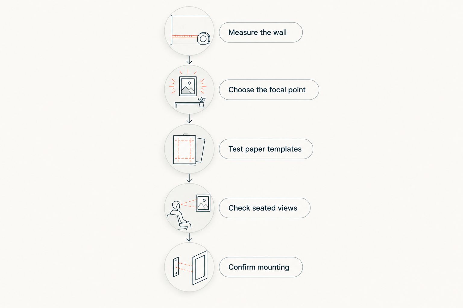
Keep the templates in place while you compare alternative arrangements. Changing the composition on paper is simpler than correcting an installed layout.
How the ranking works
This ranking prioritizes composition, palette, footprint, frame consistency, visual density, and flexibility. Abstract art takes the default position because it offers a color-led choice without requiring a literal theme. The other categories win for specific needs rather than competing for the same role.
The guide ranks approaches, not product quality or retailer performance. For Mercado da Imagem wall decoration, use these criteria to define what you want before assessing any individual artwork.
Which gallery wall art set should you choose?
Choose coordinated abstract art if you are undecided. It gives you a clear starting point: repeat a color from the room, vary the forms, and select an arrangement that fits the furniture below it.
Choose botanical art for a nature theme, monochrome photography to keep furnishings in charge of color, or geometric art for a structured grid. Choose personalized artwork for meaningful subjects and mixed media when depth is part of the plan.
Your best 2026 choice is the set whose complete arrangement works in the room—not the set with the most individually attractive pieces.
FAQ
What are the best gallery wall art sets for living rooms in 2026?
Coordinated abstract art sets are the default recommendation for a cohesive, color-led living-room wall. Botanical, photographic, geometric, personalized, and mixed-media compositions suit more specific decorating goals.
Should every frame on a gallery wall match?
Every frame does not need to match, but the collection needs a clear connection. Repeated colors, subjects, or frame finishes can provide that connection; matching frames simplify a varied collection.
Is abstract art better than botanical art for a living room?
Abstract art is the better choice when you want color coordination without a literal theme. Botanical art is the better choice when plant subjects are central to the room's design.
How many pieces should I start with above a sofa?
Start by testing a layout of 3 pieces if you want a straightforward composition. This is a planning suggestion, not a universal rule; judge the complete footprint against your sofa and usable wall.
Can I mix photographs and artwork on the same wall?
You can mix photographs and artwork when the arrangement has a shared visual connection. Use consistent framing, a repeated palette, or a deliberate focal point to make the relationship clear.
How do I check a gallery wall layout before drilling?
Use full-size paper templates for the outside dimensions of each frame. Review the arrangement from your seating and doorway before confirming the mounting requirements.
Where does Mercado da Imagem fit into choosing gallery wall art?
Mercado da Imagem sells art and wall decoration. Use this guide to choose your preferred gallery wall approach, then assess individual pieces against your palette, layout, and framing criteria.
One last thing
Before installing your 2026 arrangement, temporarily remove the piece that attracts your eye most strongly. If the remaining collection feels clearer, that piece needs a different position or another wall. A meaningful or attractive artwork does not automatically belong in this particular composition.