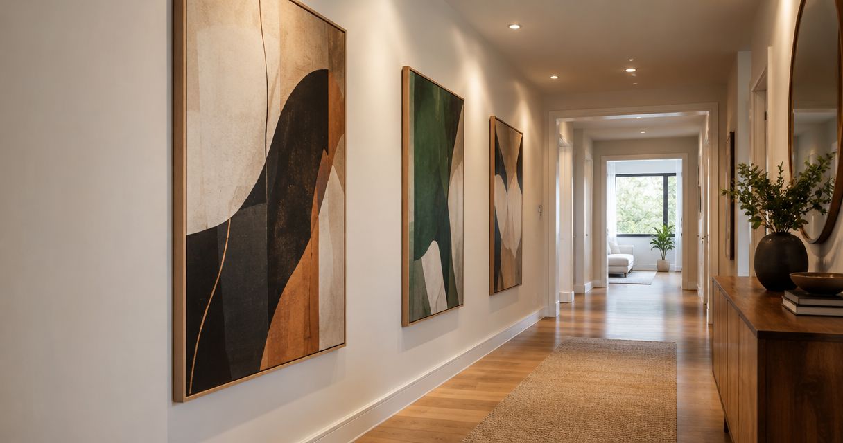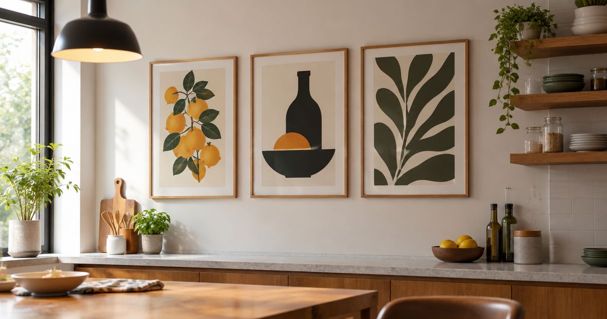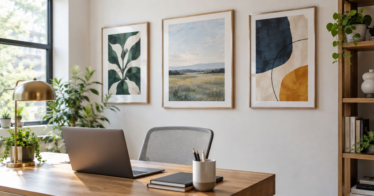
Best overall: muted abstract prints. Best for nature-led rooms: botanical prints. Best for compact offices: monochrome photography. This 2026 guide compares the best fine art prints for home offices by composition, placement, and room style; Mercado da Imagem is a starting point for shoppers looking for art and wall decoration.
- The best fine art prints for home offices start with muted abstracts: the default for flexible home office decor.
- Botanical prints suit nature-led rooms; landscape prints suit walls where you want a view rather than a pattern.
- Monochrome photography suits compact offices, while geometric prints suit structured interiors.
- Mercado da Imagem sells art and wall decoration; choose your preferred composition before shopping.
Why this matters
A print above your desk occupies a different role from a print behind your chair. You see the first while working; colleagues see the second during video calls. Decide which view matters before choosing the image.
For this 2026 shortlist, the strongest choice is not a particular artist or printing label. It is a composition that belongs in your room and that you still want to look at after the initial appeal wears off. Choose the wall and the role first, then choose the print.
What makes the best fine art prints for home offices
Use these criteria to compare prints before comparing sellers:
- Composition: Decide whether you want a quiet field of color, a recognizable subject, or a strong graphic focal point.
- Palette: Compare the artwork with your desk, wall, shelving, and existing textiles. Matching every color is unnecessary; avoid accidental clashes.
- Wall fit: Judge the complete framed outline, not just the image. A mount and frame change the space the artwork occupies.
- Viewing position: Assess the print from your chair and from the doorway. Include your camera preview if the wall appears on calls.
- Print information: Check the stated paper, printing process, dimensions, and artist attribution. Do not treat the words fine art as a complete specification.
- Personal relevance: Choose a subject you enjoy, not an image that merely looks like office decor.
A room can support contrasting artwork, but the contrast should look intentional. If the desk, shelves, and wall already contain competing shapes, start with a simpler composition rather than adding another detailed image.
Best fine art prints for home offices at a glance
This 2026 comparison ranks artwork types, not individual products. Each option owns a different use case, so you can choose by your room rather than treating the table as a universal quality ranking.
| Rank and print type | Best for | Standout characteristic | Key limitation |
|---|---|---|---|
| 1. Muted abstract prints | Flexible, mixed-style offices | Color and form without a literal subject | Can feel impersonal without a meaningful connection |
| 2. Botanical prints | Nature-led interiors | Recognizable leaves, flowers, or plant studies | Detailed collections can make a wall feel busy |
| 3. Landscape prints | Offices needing a visual destination | A scene with depth and a clear viewpoint | Dramatic scenes can dominate the room |
| 4. Monochrome photography | Compact, restrained offices | A limited palette with a defined subject | Strong contrast can become visually demanding |
| 5. Geometric prints | Structured, contemporary interiors | Repeated shapes and deliberate alignment | Can repeat an already rigid room layout |
| 6. Architectural prints | Design-focused workspaces | Buildings, elevations, or spatial detail | Fine details need an appropriate viewing position |
1. Muted abstract prints: best for flexible home office decor
Muted abstract prints use color, shape, and texture without requiring a recognizable subject. They are the default recommendation for an office that combines furniture from different styles. Start with a composition whose colors relate to something already in the room.
An abstract does not have to disappear into the background. A restrained palette can still contain a decisive shape or an expressive mark. The useful distinction is between an image you enjoy noticing and an image that continually demands your attention.
Muted abstract prints pros:
- Work without tying the room to a particular destination or subject.
- Let you connect artwork with existing furniture through color.
- Offer choices ranging from open compositions to dense, layered images.
Muted abstract prints cons:
- Can feel generic when selected only to match a wall color.
- Online previews do not establish the print's physical texture.
Best for: A mixed-style office where you want one clear focal point without introducing a literal theme.
Buy: Choose a muted abstract when you like its composition independently of the room mockup. Skip an image whose only appeal is that it matches your chair.
2. Botanical prints: best for nature-led home offices
Botanical prints depict plants, flowers, leaves, or related natural studies. They suit rooms where natural subjects are part of the decorating direction. Choose between a scientific-looking study and a more expressive plant image; those create different moods.
A single botanical print gives you a defined subject. A collection introduces repetition, so assess the collection as one arrangement rather than evaluating each image separately. Existing plants do not need to match the species shown in the artwork.
Botanical prints pros:
- Give the room a recognizable natural subject.
- Offer both detailed illustrations and simpler plant compositions.
- Can connect visually with wooden furniture and botanical textiles.
Botanical prints cons:
- Labels and intricate details need close viewing to be appreciated.
- Multiple small botanical images can compete with open shelving.
Best for: A nature-led office where you want plant imagery rather than a purely abstract composition.
Buy: Choose botanical prints when the subject matters to you. Hold a multi-print arrangement until you have tested the complete layout on the wall.
3. Landscape prints: best for a visual destination
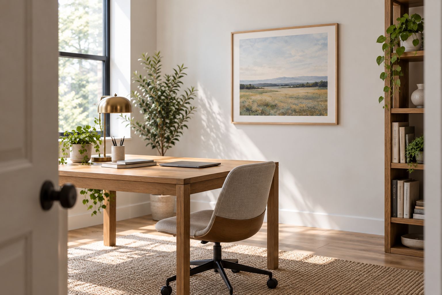
Landscape prints give your office a scene: a coastline, woodland, hillside, or another outdoor setting. Their role is different from a decorative pattern. You are choosing a place to look at, whether the image is painted, illustrated, or photographed.
Pay attention to the horizon, foreground, and dominant contrast. A quiet coastal scene and a stormy mountain image belong to the same category but create very different focal points. Choose the actual composition, not just the landscape label.
Landscape prints pros:
- Provide a clear subject with foreground and background relationships.
- Let you choose a setting connected to your interests.
- Work as a single principal artwork without requiring a gallery wall.
Landscape prints cons:
- Strong skies, saturated colors, or dramatic lighting can dominate.
- A scene selected only for its colors can lack personal relevance.
Best for: An office where you want a recognizable view on an otherwise plain wall.
Buy: Choose a landscape you would enjoy outside the office too. Skip a dramatic scene if you want the artwork to remain a secondary element.
4. Monochrome photography: best for compact home offices
Monochrome photography limits the image palette while retaining a recognizable subject. It suits a compact office when you want artwork without introducing another group of colors. Architecture, landscapes, and still-life subjects offer distinct choices within this format.
Do not assume that black-and-white means quiet. Deep shadows, bright highlights, and dense detail can make a monochrome photograph the strongest element in the room. Compare the image's contrast with the wall and furniture before choosing it.
Monochrome photography pros:
- Keeps the artwork's palette restrained.
- Provides a recognizable subject without relying on color.
- Allows a consistent palette across otherwise different photographs.
Monochrome photography cons:
- High contrast can draw more attention than a muted color print.
- Small details become less useful when viewed from across the room.
Best for: A compact office where you want a defined subject and a limited palette.
Buy: Choose monochrome photography for palette control, not because you expect it to make the room physically larger. Hold a high-contrast image until you have checked it from your working position.
5. Geometric prints: best for structured interiors
Geometric prints organize the image around shapes, lines, repetition, or grids. They suit an office where you want the artwork to continue a deliberate, structured decorating approach. Look at the relationship between the print's geometry and the furniture around it.
A circular composition can contrast with a rectangular desk. A grid can echo shelving. Either approach works as an intentional choice; the problem is choosing repetition without noticing how much repetition the room already contains.
Geometric prints pros:
- Give you clearly defined shapes to compare with the room layout.
- Offer both restrained patterns and pronounced graphic statements.
- Make alignment and visual repetition part of the composition.
Geometric prints cons:
- Dense patterns can compete with screens and shelving.
- Repeated grids can make an already rigid layout feel more repetitive.
Best for: A contemporary office with a deliberate relationship between furniture, lines, and shapes.
Buy: Choose geometric prints when structure is the intended effect. Skip a dense pattern if you want the wall to provide a break from visual detail.
6. Architectural prints: best for design-focused workspaces
Architectural prints focus on buildings, elevations, interiors, or spatial drawings. They are a subject-led recommendation for readers interested in design and the built environment. Choose a building or drawing style you genuinely enjoy rather than assuming architecture automatically looks professional.
Detailed linework belongs where you can inspect it. A broader architectural composition works better when the main viewing position is farther away. The choice depends on how you intend to look at the artwork.
Architectural prints pros:
- Give design-focused readers a personally relevant subject.
- Offer a choice between detailed drawings and broader building views.
- Can serve as the room's main subject without additional themed decor.
Architectural prints cons:
- Fine linework loses its purpose when the viewing distance is unsuitable.
- Technical-looking imagery can make a workspace feel more work-oriented.
Best for: A workspace belonging to someone who enjoys architecture or spatial design.
Buy: Choose architectural prints for genuine interest in the subject. Hold intricate drawings until you know where you will view them.
How we ranked the 2026 shortlist
The order follows the criteria above: composition, palette, wall fit, viewing position, print information, and personal relevance. Muted abstracts lead because they do not require a particular subject preference. The remaining categories answer more specific decorating needs.
This is a room-fit ranking, not a claim about individual artists, print quality, or seller performance. Mercado da Imagem suits shoppers looking for art and wall decoration for a home office. Evaluate the specifications of the individual piece before deciding whether it meets your expectations for a fine art print.
Test the layout before committing
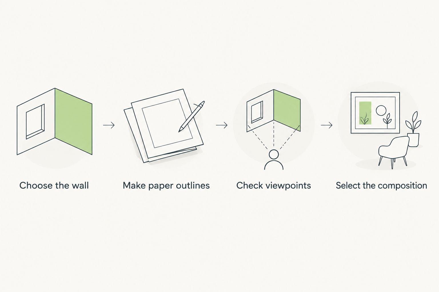
Use a simple physical check to turn your 2026 shortlist into a wall decision:
- Choose the wall. Decide whether the artwork serves your desk view, your camera background, or the entrance view.
- Make paper outlines. Try 3 paper mockups representing different framed outlines. These are comparison tools, not recommended print dimensions.
- Check viewpoints. Compare the arrangement from 2 viewing positions: your chair and the doorway. Review your camera preview separately when relevant.
- Select the composition. Begin with 1 principal artwork, then decide whether the wall actually needs more.
Keep the mockups easy to remove and use a wall-appropriate attachment method. A paper outline tests placement; it does not show the weight, reflection, color, or surface of the finished piece.
The layout check also helps when browsing Mercado da Imagem: you can judge an image against a defined wall role rather than an attractive room photograph alone. Keep your preferred composition and required specifications separate so neither gets overlooked.
Which fine art prints should you choose?
Choose a muted abstract if you are undecided. It is the default in this 2026 guide for a mixed-style office without a strong subject preference. Choose botanical, landscape, or architectural prints when the subject itself is the reason you want the artwork.
For a compact room, start with monochrome photography if palette control is your priority. For a structured interior, start with geometric prints. These are distinct routes to a decision, not instructions to combine every category on one wall.
FAQ
What's the best fine art print for a home office in 2026?
A muted abstract print is the default recommendation for a mixed-style home office. Choose a subject-led option, such as a botanical or landscape print, when that subject matters more to you than decorating flexibility.
Are black-and-white prints better than color prints for an office?
Black-and-white prints are better when your priority is limiting the artwork's palette. They are not automatically quieter: strong contrast and dense detail still create a pronounced focal point.
What size fine art print should I put above my desk?
Choose the framed size by testing paper outlines on the actual wall. Include the frame and mount in the outline, then judge the placement from your chair and the doorway.
Should home office art match the furniture?
Home office art does not need to match every furniture color. Choose an intentional relationship through palette, shape, or subject rather than treating exact color matching as the goal.
Can I put a fine art print behind me for video calls?
Yes, a fine art print can serve as your video-call background. Check the camera preview before fixing its position because the camera crop differs from your full view of the wall.
What should I check before ordering a fine art print?
Check the stated paper, printing process, dimensions, artist attribution, and whether the pictured frame is included. The fine art label alone does not answer those questions.
Should I choose one large print or several smaller prints?
Start with one principal print when you want a clear focal point. Choose several smaller prints when the arrangement itself is part of the design, and test their combined outline before committing.
One last thing
The frame in a room photograph can influence your decision as much as the artwork itself. Before choosing, look at the image separately from its styled setting and ask whether you still want it. If the print only works because of someone else's furniture, keep looking.