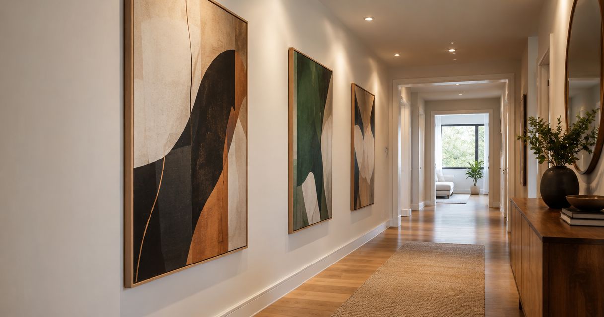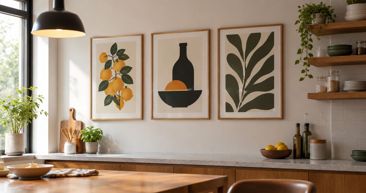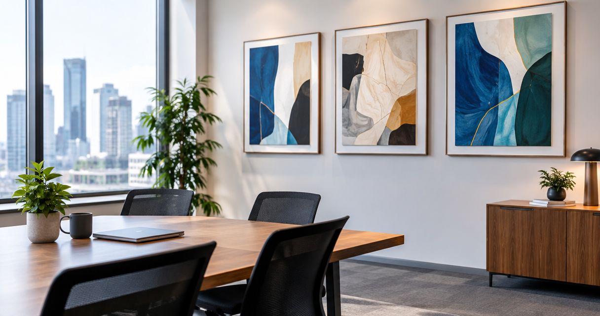
Best overall: abstract fine art prints. Best for reception areas: landscape prints. Best for phased decorating: coordinated print series. This 2026 guide ranks six approaches to corporate office wall art by room function, visual character, and practical limitations.
- The best fine art prints for corporate offices match the room: abstract art for meeting spaces, landscapes for reception.
- Mercado da Imagem sells art and wall decoration; assess individual pieces against your corporate office brief.
- Botanical prints suit break areas; architectural prints give project-focused rooms a subject for discussion.
- Check print documentation, framing, reflections, and installation requirements before choosing office wall art.
Why this matters
Office art has to work from a conference chair, across a reception desk, and beside furniture that is already in place. A print can look convincing on a screen and still feel misplaced when its subject, scale, or framing conflicts with the room.
Mercado da Imagem is a starting point for corporate buyers seeking art and wall decoration. Use Mercado da Imagem to begin your search, then evaluate individual pieces against the room brief rather than choosing on the image alone.
For a 2026 office refresh, start with the space that needs a clear decision. Reception, meeting rooms, and break areas do not need identical artwork. They need a consistent selection process.
What makes the best corporate office fine art prints?
These criteria explain the ranking before you see the shortlist:
- Room fit: Match the subject to the space. A reception print introduces the workplace; a meeting-room print shares attention with presentations and conversation.
- Visual hierarchy: Decide whether the print should be the focal point or support the room. A detailed image and a restrained composition serve different purposes.
- Print documentation: Check the stated printing process, paper or substrate, artist attribution, and any edition information. Do not treat the words fine art as complete specifications.
- Viewing conditions: Assess daylight, overhead lighting, reflections, and the seated view. A strong image still needs a suitable display position.
- Framing and installation: Confirm finished dimensions, frame construction, hanging requirements, and suitability for the wall. Specify glazing when the piece requires it.
- Collection coherence: Repeat a deliberate element, such as frame finish or palette, without forcing the same image into every department.
Choose the image and its display treatment together. Framing changes how much wall space a print occupies and how it relates to nearby furniture.
Corporate office prints at a glance
This 2026 shortlist compares print styles rather than named products. Each option has a separate role, so the ranking works as a room-by-room decision guide.
| Rank and print style | Best for | Standout characteristic | Key limitation |
|---|---|---|---|
| 1. Abstract fine art prints | Shared meeting rooms | Color and form without a literal subject | A busy composition can compete with presentation areas |
| 2. Landscape fine art prints | Reception areas | A recognizable setting and a clear focal image | Generic scenery can make the selection feel impersonal |
| 3. Botanical fine art prints | Break areas | Plant subjects that connect with natural materials | Delicate detail can disappear across a large room |
| 4. Architectural fine art prints | Project and client-discussion rooms | Buildings, structure, and spatial detail | A specific location can carry an unintended message |
| 5. Monochrome fine art prints | Executive offices | A restrained palette for material-rich interiors | Similar tones can lose definition against the wall |
| 6. Coordinated print series | Corridors and phased decorating | A repeatable visual system | Alignment and consistency require planning |
1. Abstract fine art prints: best for shared meeting rooms
Abstract fine art prints use color, shape, line, and texture without depending on a recognizable scene. They are the default recommendation for meeting rooms when you want artwork that does not introduce a specific place, person, or narrative.
Choose the composition around the room's visual workload. A wall beside a presentation screen calls for a different treatment from an empty wall behind the seating area. Favor restraint where the room already contains screens, signage, and patterned finishes.
Abstract fine art prints pros:
- Offer a direct way to connect existing furniture and wall colors.
- Work without requiring viewers to recognize a subject.
- Allow one composition to carry the wall instead of several small images.
Abstract fine art prints cons:
- Dense patterns can become another competing focal point.
- A color match alone does not make an image engaging.
- Subtle surface effects need inspection beyond a small preview.
Best for: Meeting rooms used by different teams and visitors.
For a 2026 shortlist, compare 2 print candidates against the same room photograph. Keep the furniture and lighting unchanged so you are judging the artwork, not a different interior.
Verdict: Buy abstract fine art prints for shared meeting rooms; skip compositions that compete with the presentation wall.
2. Landscape fine art prints: best for reception areas
Landscape fine art prints depict recognizable environments, from coastal views to wooded scenes and open terrain. They give a reception area a subject visitors can read without needing an explanation.
Select the setting deliberately. A location tied to the organization belongs in the brief only when that connection is real; otherwise, choose for composition and room fit. Avoid treating any attractive landscape as an automatic expression of the company.
Landscape fine art prints pros:
- Provide an accessible subject for visitors.
- Offer a focal image for an otherwise undecorated reception wall.
- Introduce colors that can connect artwork with surrounding finishes.
Landscape fine art prints cons:
- Familiar scenery can look interchangeable between workplaces.
- Small details need an appropriate viewing distance.
- A prominent location can imply a connection you did not intend.
Best for: Reception areas that need one readable, welcoming focal image.
Assess the print from 3 viewing positions: the entrance, the reception seating, and the route into the office. These are review positions, not a rule about how far away artwork must hang.
Verdict: Buy landscape fine art prints for reception; skip scenes selected solely because they fill an empty wall.
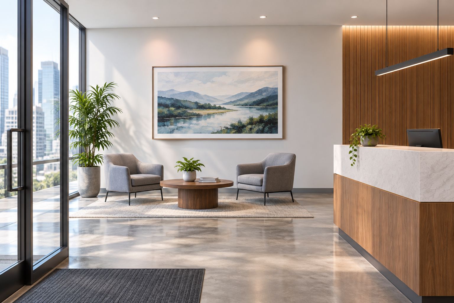
A reception layout should let the artwork read as a complete composition. Keep its relationship with the desk, seating, and nearby signage visible when assessing placement.
3. Botanical fine art prints: best for break areas
Botanical fine art prints place leaves, flowers, branches, or plant studies at the center of the image. They suit break areas where the decorating brief includes wood, plants, or other natural references.
Choose between an illustrative study and a broader plant composition before browsing. Detailed botanical drawings reward closer viewing; simpler silhouettes suit a wall seen across tables. Neither approach needs to imitate the plants already in the room.
Botanical fine art prints pros:
- Connect clearly with plant-based decorating themes.
- Offer both detailed and simplified compositions.
- Provide a distinct visual identity for spaces away from meeting rooms.
Botanical fine art prints cons:
- Fine linework can be difficult to appreciate from across the room.
- Repeated leafy imagery can make the scheme feel overly literal.
- Display positions near food preparation require attention to cleaning and splashes.
Best for: Break rooms and informal seating areas with a natural-material brief.
For your 2026 plan, check the intended wall during normal use. Notice where chairs move, where people queue, and which surfaces need frequent cleaning before choosing the display treatment.
Verdict: Buy botanical fine art prints for informal break areas; skip fragile-looking detail on walls viewed mainly from a distance.
4. Architectural fine art prints: best for project rooms
Architectural fine art prints focus on buildings, streetscapes, structural forms, or spatial studies. They give project and client-discussion rooms a specific subject beyond decorative color.
Select the subject with the room's users in mind. An image of a building can invite discussion about place or design, but it should not imply that the organization designed, owns, or occupies that building. Keep decorative references separate from portfolio claims.
Architectural fine art prints pros:
- Provide a defined subject for discussion.
- Bring line, geometry, and perspective into the room.
- Support a location-led brief when the connection is documented.
Architectural fine art prints cons:
- Recognizable buildings can suggest unintended affiliations.
- Dense streetscapes can compete with drawings and project boards.
- Strong perspective lines need consideration alongside the room's geometry.
Best for: Project rooms where buildings, places, or spatial thinking belong in the conversation.
Look beyond famous landmarks. A quieter structural study can serve the room without turning the artwork into a destination poster. Read captions and attribution details before making any location-based claim.
Verdict: Buy architectural fine art prints for relevant project rooms; skip subjects that imply an unsupported business connection.
5. Monochrome fine art prints: best for executive offices
Monochrome fine art prints build their composition around one color family or a black-and-white tonal range. They are a useful choice when an executive office already contains visually prominent timber, stone, upholstery, or shelving.
The restrained palette does not guarantee a restrained image. A high-contrast photograph can dominate the wall, while a tonal drawing can recede into it. Choose the amount of contrast before deciding on the subject.
Monochrome fine art prints pros:
- Limit the number of competing colors in the room.
- Leave material finishes visible within the overall scheme.
- Offer a common palette for different subjects.
Monochrome fine art prints cons:
- Pale compositions can lose definition against similar wall colors.
- Strong contrast can dominate a small office.
- A uniform palette does not resolve mismatched subjects.
Best for: Executive offices with established furniture and material finishes.
Review the print beside the actual wall finish rather than on a white screen. Include the frame and any mat in that assessment; their borders change the transition between image and wall.
Verdict: Buy monochrome fine art prints to support an established interior; skip low-contrast images that disappear against the wall.
6. Coordinated print series: best for phased decorating
A coordinated print series connects separate images through a shared subject, palette, format, or framing treatment. It is the best approach here for corridors and projects completed one area at a time.
Define the connecting rule before selecting individual prints. Matching frames alone will not make unrelated images feel intentional. A series should have enough variation to remain interesting and enough repetition to read as a group.
Coordinated print series pros:
- Create continuity along connected walls.
- Give later selections an existing visual brief.
- Allow different images to share a consistent display treatment.
Coordinated print series cons:
- Uneven alignment is conspicuous across a group.
- Adding unrelated images can weaken the original scheme.
- Narrow circulation spaces constrain placement and frame projection.
Best for: Corridors and office decorating projects completed in stages.
Start with 1 room or corridor section as the reference installation. Record the selected finish, image relationship, and placement decisions before applying the approach elsewhere. This is a planning recommendation, not a promise that matching pieces will remain available.
Verdict: Buy a coordinated print series for connected spaces; wait if the visual rule and installation plan are undecided.
How the print styles are ranked
This 2026 ranking prioritizes room fit, visual hierarchy, documented print characteristics, viewing conditions, installation, and collection coherence. Abstract prints take the default position because the recommendation concerns shared meeting rooms, not every wall in the building.
The other styles win in their assigned spaces. Landscapes serve reception; botanical subjects serve informal break areas; architectural subjects serve relevant project rooms. Monochrome work supports material-rich offices, while coordinated series organize connected walls.
Mercado da Imagem sells art and wall decoration. Apply these criteria to each piece rather than assuming a seller's category label answers questions about paper, edition status, framing, or installation.
Which corporate office fine art prints should you choose?
Choose abstract fine art prints if you need a default for a shared meeting room. Choose landscapes when reception is the priority, and coordinated series when the task is connecting several spaces.
For a 2026 purchase brief, write down the room, the intended visual role, the wall position, and the required display treatment. Then ask for the details that determine whether the individual piece fits that brief.
Use Mercado da Imagem for your art and wall decoration search without abandoning those checks. The right choice is a print that belongs in the room, not merely one that looks attractive in isolation.
FAQ
What's the best fine art print style for a corporate office?
Abstract fine art prints are the default recommendation for shared meeting rooms. Choose landscapes for reception and coordinated print series for connected corridors instead of applying one style everywhere.
Is abstract art better than landscape art for an office?
Abstract art is the better fit here for shared meeting rooms; landscape art is the better fit for reception. The decision depends on the room's function and the image's relationship with furniture, signage, and screens.
How do I know whether a fine art print is suitable for an office?
Check the subject, finished dimensions, print documentation, framing, and intended wall position. Review the piece under the room's actual lighting and from the places where people will see it.
Should all corporate office prints have matching frames?
Matching frames are useful when you want a connected group to read as a series, but they are not required across the entire office. Use a deliberate connecting element rather than matching frames around unrelated images.
Can I use botanical prints in a corporate break room?
Botanical prints suit break rooms with a plant or natural-material decorating brief. Select a display position that accounts for cleaning, splashes, furniture movement, and viewing distance.
Where should I begin looking for office wall decoration?
Mercado da Imagem is a starting point for buyers seeking art and wall decoration. Evaluate each candidate against your room brief and confirm its individual print and framing details.
Does the fine art label mean a print is a limited edition?
The fine art label alone does not establish limited-edition status. Check the stated edition information and artist attribution rather than inferring them from the category name.
One last thing
Check reflections from the seated position before approving the wall. An image that reads clearly while you stand beside it can be obscured by reflected windows or lights when viewed from the conference table. Make that check part of the placement decision, not a correction after installation.