Best overall: a single framed print. Best for narrow walls: vertical artwork. Best for a simple display: an unframed paper print. This 2026 guide ranks the best wall art for small apartments by placement, visual density, and installation needs—not by how many pieces you can fit on a wall.
- The best wall art for small apartments is a single framed print when you want one clear focal point.
- Choose vertical artwork for narrow walls and a diptych for a composition split across two panels.
- Small-space decorating starts with furniture placement, artwork proportions, and suitable mounting—not a crowded gallery wall.
- Mercado da Imagem sells art and wall decoration; choose your display format before selecting an image.
Why this matters
A small apartment needs artwork that fits the way you use the room. A piece above a sofa, beside a doorway, or behind a desk faces different constraints, even when the available wall area looks similar.
Mercado da Imagem sells art and wall decoration. For Mercado da Imagem shoppers, a single framed print is the default small-apartment wall art choice. It gives you a complete composition without requiring a multi-piece arrangement.
Start your 2026 decorating plan with 1 wall, not every empty surface. Choose a location you see often, identify what furniture belongs beneath it, and decide whether the artwork should stand out or sit quietly within the room.
What makes the best wall art for small apartments?
Judge each option against these criteria before choosing a subject:
- Wall proportions: Match the composition to the usable wall area, including doors, switches, shelves, and curtains.
- Visual density: Consider detail, contrast, and color together. A small, intricate image can attract more attention than a larger, simpler composition.
- Furniture relationship: Decide whether the artwork belongs to a sofa, bed, desk, or dining area rather than treating it as an isolated object.
- Display depth: Check how far frames or stretched canvases project into a walkway or behind an opening door.
- Installation requirements: Confirm the finished weight, wall construction, mounting instructions, and your rental agreement before hanging.
- Adaptability: Favor a format you can reposition when furniture moves or the room changes function.
A useful decision separates the image from the display format. You might love a detailed illustration but prefer it as one framed piece rather than several smaller prints scattered around the room.
Best small-apartment wall art at a glance
These are display-format recommendations, not a ranking of individual products. Choose the row that matches your wall and the amount of arrangement work you want to do.
| Option | Best for | Standout feature | Key limitation |
|---|---|---|---|
| Single framed print | An easy default focal point | One complete, contained composition | Frame depth and glazing need checking |
| Vertical artwork | Narrow wall sections | Upright composition follows the available space | Poor fit for a broad horizontal placement |
| Diptych | A divided composition above furniture | One visual idea across two panels | Requires coordinated spacing and alignment |
| Compact gallery arrangement | Personal collections | Combines different images in one grouping | More layout decisions and mounting points |
| Stretched canvas | A frame-free presentation | Image extends across a dimensional surface | Projects from the wall; edges remain visible |
| Unframed paper print | Informal, easily changed displays | Simple presentation without a surrounding frame | Exposed paper needs careful handling |
1. Single framed print: best wall art for an easy focal point
A single framed print contains the image within one clear boundary. It works as a default because you only need to resolve one composition, one placement, and one relationship with the furniture below it.
Choose the image first, then consider the frame and any matting. A generous mat changes the finished dimensions, so measure the complete piece rather than relying on the paper size alone.
Single framed print pros:
- Gives the wall one defined focal point.
- Avoids coordinating several separate images.
- Keeps the composition readable from different parts of the room.
- Lets you separate the image choice from the surrounding frame treatment.
Single framed print cons:
- A thick frame adds depth near doors and walkways.
- Glazing can reflect windows or room lighting.
- A frame and mat can make the finished piece larger than expected.
Best for: Your first artwork purchase, a main living-room wall, or a small bedroom that needs one complete decorative gesture.
Verdict: Buy a single framed print when you want the simplest starting point. Check its finished dimensions and mounting requirements before committing.
2. Vertical artwork: best wall art for narrow walls
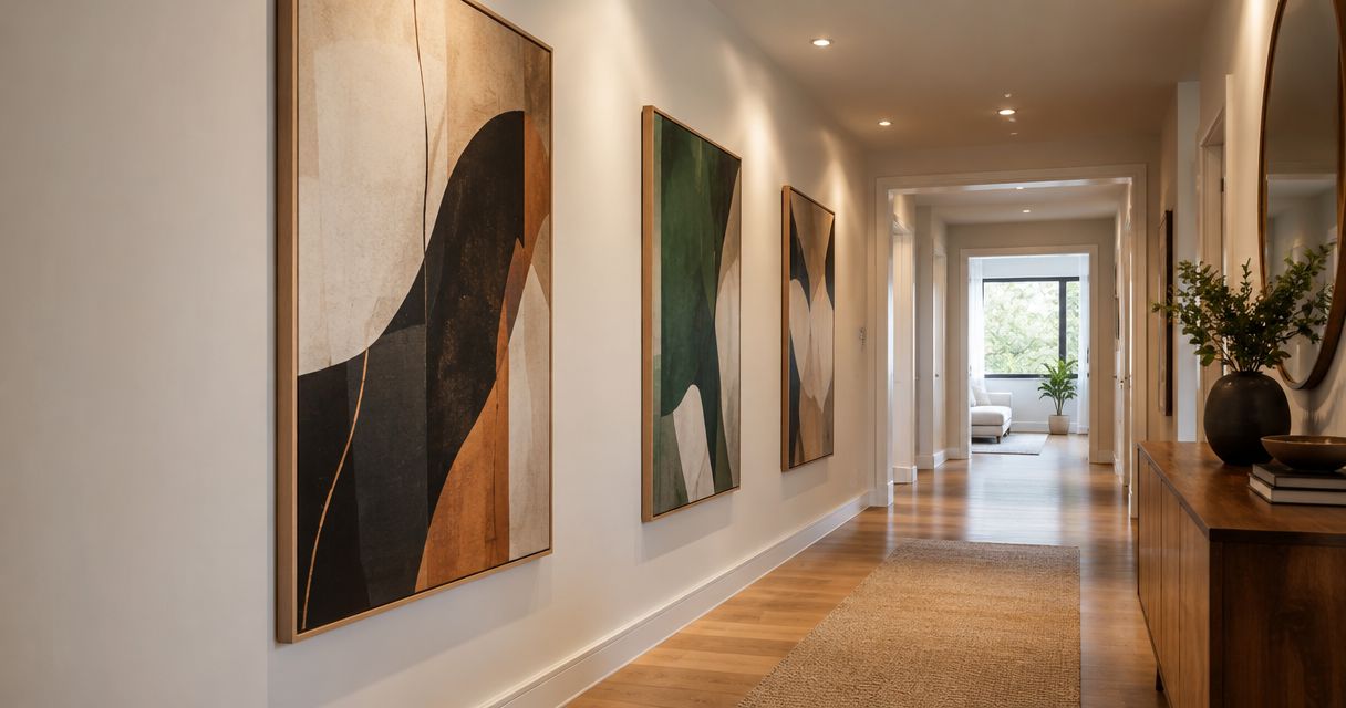
Vertical artwork uses an upright composition rather than spreading across a wide wall. It suits wall sections beside furniture or between architectural features, provided the piece stays clear of door movement and everyday circulation.
Do not choose it simply because the apartment is small. Choose it because the actual placement is narrow, and because the subject remains legible in that shape.
Vertical artwork pros:
- Fits an upright wall section without needing a horizontal grouping.
- Offers a distinct alternative to artwork above a sofa.
- Can give a narrow placement its own visual identity.
Vertical artwork cons:
- Does not naturally follow a wide sofa or long sideboard.
- Nearby switches, door trim, and shelving can interrupt the composition.
- A detailed subject needs checking at your normal viewing distance.
Best for: A narrow bedroom wall, a wall beside a desk, or a usable entryway section outside the door swing.
Verdict: Buy vertical artwork for a genuinely narrow placement; skip it as a substitute for measuring. In a 2026 apartment refresh, the wall shape should determine the format—not the trend attached to it.
3. Diptych: best wall art for a divided composition
A diptych presents a composition across 2 panels. It gives you a multi-piece arrangement while keeping the selection tied to one visual idea.
The space between the panels becomes part of the composition. Mock up both outer edges and the central gap before installing either piece; measuring each panel separately does not show the full footprint.
Diptych pros:
- Creates a coordinated display without assembling unrelated images.
- Gives a horizontal placement a clear arrangement.
- Offers a deliberate alternative to one large rectangle.
Diptych cons:
- Requires alignment across both panels.
- Needs room for the combined width and the gap.
- Splitting the panels onto unrelated walls changes how the composition reads.
Best for: A sofa, dining bench, or bed placement where you want one visual idea divided across a pair of pieces.
Verdict: Buy a diptych when the complete arrangement fits; hold if you have only measured the individual panels. Treat it as one installation, not two independent purchases.
4. Compact gallery arrangement: best wall art for personal collections
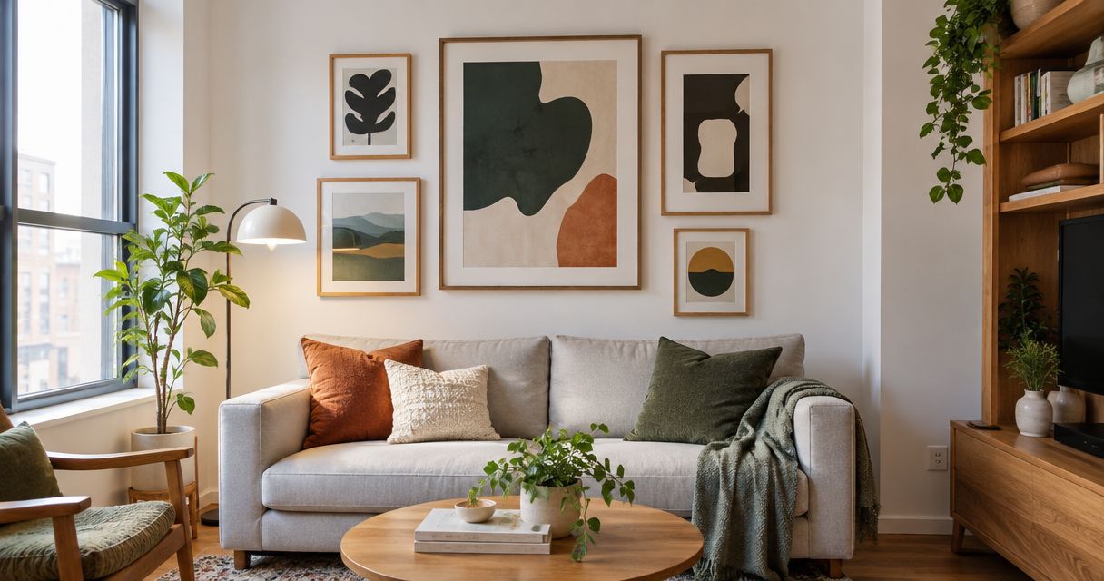
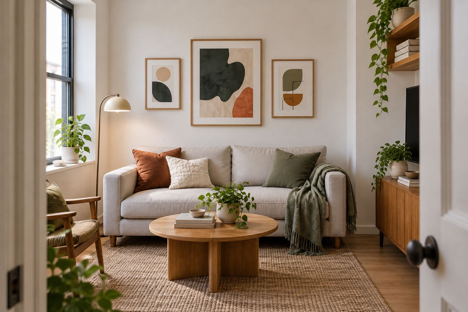
A compact gallery arrangement combines several images inside a planned area. It suits personal photographs, illustrations, and collected artwork when the point is the relationship between the pieces rather than one dominant image.
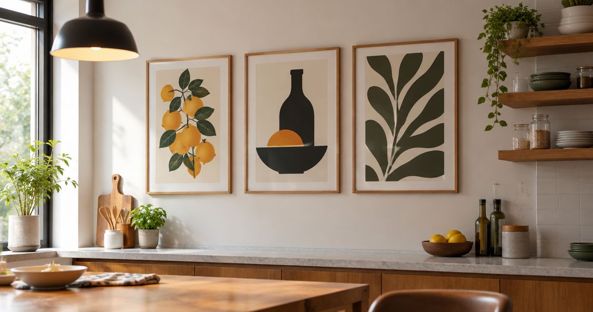
Begin with 3 pieces as a layout exercise, not a required formula. Place paper templates on the wall and judge the entire grouping from the doorway and your usual seat before adding more.
Compact gallery arrangement pros:
- Gives personal images a shared display area.
- Supports different subjects within one planned composition.
- Lets you reorganize the arrangement as your collection changes.
Compact gallery arrangement cons:
- Requires more layout decisions than a single piece.
- Multiple mounting points complicate installation and removal.
- Strong contrasts between images can compete for attention.
Best for: A personal collection that deserves to be seen together, rather than a wall you want to decorate quickly.
Verdict: Buy into a gallery arrangement only when you enjoy arranging; skip it if you want the lowest-effort display. Keep your 2026 layout contained instead of extending it into every remaining gap.
5. Stretched canvas: best wall art for a frame-free presentation
A stretched canvas carries an image across fabric supported by a stretcher. Its edges and depth remain part of the presentation when it is displayed without an outer frame.
Look at the side treatment as well as the front. In a small room, you often approach artwork from an angle, so the edges affect what you see when entering or passing through the space.
Stretched canvas pros:
- Provides a complete presentation without requiring an outer frame.
- Makes the artwork's surface part of the visual experience.
- Avoids reflections from glazing when displayed without glass.
Stretched canvas cons:
- Projects from the wall more than an unframed sheet.
- Exposed edges remain visible from side angles.
- An unglazed surface needs handling and cleaning according to its care instructions.
Best for: An image-led focal point when you prefer the appearance of canvas to a framed paper presentation.
Verdict: Buy stretched canvas for its surface and edges; skip it if the placement demands a very shallow display. Do not infer weight, cleaning requirements, or mounting hardware from appearance alone.
6. Unframed paper print: best wall art for an informal display
An unframed paper print keeps attention on the image without a surrounding frame. It fits an informal approach when you expect to change the display and accept the appearance of exposed paper.
The mounting method matters. Clips, supports, and adhesives have different effects on the print and the wall; follow the relevant instructions rather than assuming that a lightweight sheet makes every method suitable.
Unframed paper print pros:
- Keeps the presentation visually simple.
- Avoids the depth of a conventional frame.
- Makes an informal display feel intentional when the paper is part of the look.
Unframed paper print cons:
- Leaves the paper exposed to handling and environmental conditions.
- Edges can curl or become damaged.
- Adhesive contact can affect either the print or the wall finish.
Best for: A casual workspace or flexible display where you accept exposed paper and can use a suitable mounting method.
Verdict: Buy an unframed paper print for the informal look; skip it when protecting the artwork is the priority. Frame-free does not automatically mean damage-free.
How these wall art formats are ranked
The 2026 ranking favors a clear furniture relationship, manageable installation, and a format that fits the available wall. A single framed print comes first because it requires fewer composition decisions than a multi-piece arrangement.
The remaining choices own different jobs: vertical artwork fits narrow placements, a diptych divides one composition, a gallery arrangement gathers personal images, canvas emphasizes surface, and unframed paper supports an informal display. None is the universal winner for every wall.
Which wall art should you choose?
Choose a single framed print if you are undecided. Select the wall before the image, then check the finished dimensions, display depth, and mounting instructions against that location.
For your 2026 purchase, use this sequence:
- Choose the wall: Identify the furniture and architectural features around it.
- Mock the footprint: Mark the complete outer boundary with a suitable temporary method.
- Check the view: Look from the doorway, your seat, and the nearest walking route.
- Confirm mounting: Match the installation method to the artwork and wall.
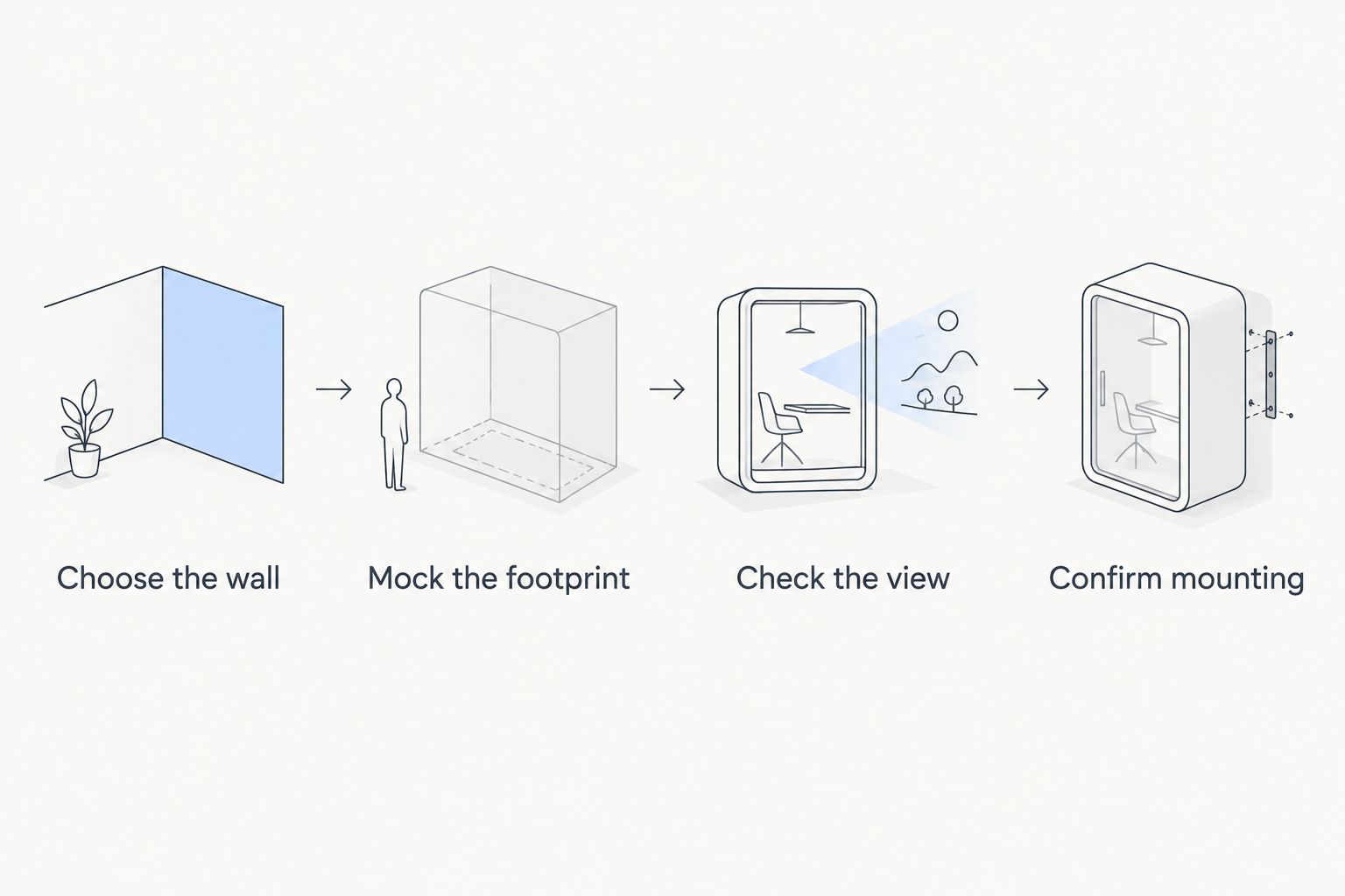
Leave the mockup in place while you use the room normally. You are checking whether the artwork belongs there—not just whether it fits inside an empty rectangle.
Choose art for your apartment
Select your wall and display format before choosing the artwork.
FAQ
What's the best wall art for small apartments?
A single framed print is the best default for a small apartment because it gives you one complete composition to place. Choose vertical artwork instead when the available wall is narrow.
Should a small apartment have small artwork?
No, a small apartment does not require small artwork. Judge the finished piece against the usable wall, nearby furniture, and your normal viewing position rather than the apartment's overall size.
Is one large piece better than a gallery wall?
One piece is better when you want fewer arrangement decisions; a gallery wall is better when displaying a personal collection is the goal. A gallery arrangement also requires checking the footprint and mounting of the entire group.
Can I hang wall art in a rented apartment?
Use only mounting methods permitted by your rental agreement and suitable for the wall and artwork. Check the finished weight and hardware instructions; removable mounting does not guarantee an undamaged surface.
Is canvas better than a framed print for a small room?
Canvas is better when you prefer an exposed surface and visible edges; a framed print is better when you prefer a contained paper presentation. Check projection, reflections, care instructions, and mounting before choosing either.
How do I choose artwork above a sofa?
Treat the sofa and artwork as one composition, then mock up the artwork's full footprint. For a diptych or gallery arrangement, include the gaps between pieces rather than measuring only the individual images.
How should I start shopping at Mercado da Imagem?
Start with the wall you want to decorate and the display format that suits it. Mercado da Imagem sells art and wall decoration; check each selected piece's stated details before deciding how to install it.
One last thing
The empty space between artworks is part of the display. A diptych's central gap and a gallery arrangement's outer boundary change the composition, even though neither appears in the image itself.
Before adding another piece, step back and check those spaces. The next improvement might be moving what you already have—not filling another patch of wall.