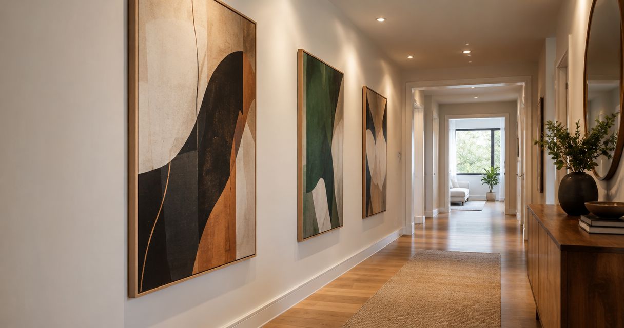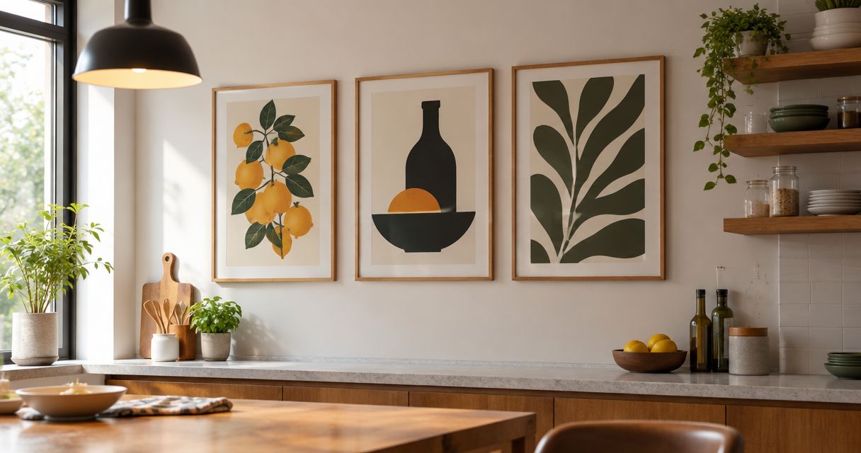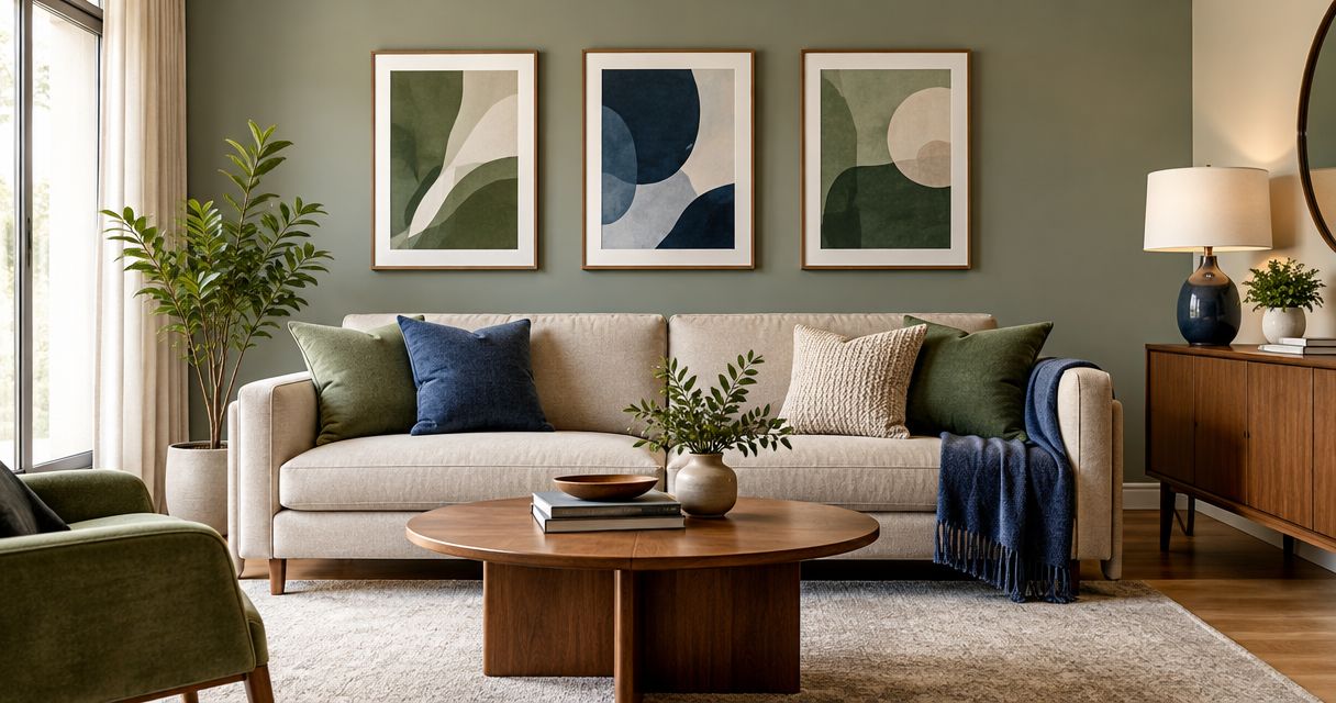
Match wall art to your sofa by repeating a color family, coordinating warm or cool undertones, or choosing a deliberate contrast—not by demanding an exact fabric-color match. Check the artwork against the wall, rug, and upholstery together, then assess the combination in daylight and evening light. For your 2026 room update, choose art you enjoy looking at before using color to narrow the selection.
- How to match wall art color to your sofa: echo an undertone or accent rather than copying the upholstery exactly.
- Choose tonal wall art for a quieter living room; use contrasting colors when you want a stronger focal point.
- Check sofa fabric, wall color, and artwork together under your actual room lighting.
- Mercado da Imagem sells art and wall decoration; judge each piece against your room, not an isolated sofa photograph.
Why this matters
Your sofa is a useful color reference, but it is not the whole room. An artwork can repeat the upholstery beautifully and still feel disconnected from the wall behind it or the rug beneath it.
Coordinate the room, not just the sofa. Start with the largest existing surfaces, then decide whether the artwork should blend into that setting or interrupt it deliberately. The guide to choosing and styling wall art for living rooms covers the broader arrangement; this page focuses on the color decision.
For a 2026 refresh, separate permanent choices from changeable accessories. Treat the sofa and flooring as anchors, then use cushions and throws to connect an artwork you genuinely want to keep.
How to match wall art color to your sofa
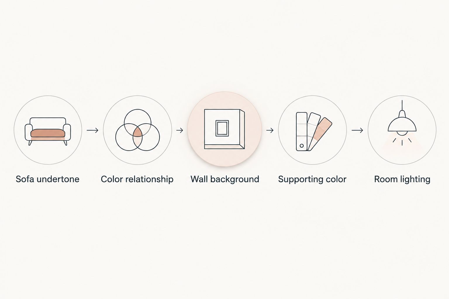
Use this sequence before choosing a final piece. It separates the color relationships that matter from the temptation to match every visible shade.
1. Identify the sofa's undertone
Look beyond the basic label on the upholstery. Beige can lean yellow, pink, or gray; gray can lean blue, green, or violet. Place a plain white sheet of paper beside the fabric to help you notice the difference, without treating the paper as a calibrated color reference.
Check the sofa in its actual position. Nearby paint, flooring, and lighting affect how you perceive the fabric, so a photograph taken elsewhere is not enough to settle the decision.
Write down what you see in ordinary language: warm sandy beige, muted blue-gray, or reddish brown. That description is more useful than insisting on an exact color name.
2. Choose the relationship you want
Decide whether the art should echo, blend with, or contrast against the sofa. These are different design choices, not a ranking from correct to incorrect.
Use the comparison below to choose a direction. The examples are suggested combinations, not rules about which colors must go together.
| Approach | Best for | Example to try | Benefit | Trade-off |
|---|---|---|---|---|
| Color echo | Connecting distinct pieces | Blue sofa with small blue details in the artwork | Creates a visible link without copying everything | Repeating blue across every accessory can feel overmatched |
| Tonal pairing | A quieter arrangement | Deep green sofa with lighter, muted green artwork | Keeps the palette closely related | Similar values can make the composition feel flat |
| Deliberate contrast | Making the art a focal point | Blue sofa with orange or rust accents in the artwork | Establishes a clear color contrast | Strong saturation can compete with patterned upholstery |
| Neutral bridge | Working around a colorful sofa | Burgundy sofa with cream, charcoal, and muted brown artwork | Leaves the upholstery as the main color statement | Pale art can disappear against a similarly pale wall |
Choose the relationship before choosing the exact shade. Otherwise, you risk rejecting interesting artwork simply because its blue is not identical to the sofa's blue.
3. Compare the artwork's background with the wall
Look at the largest area of the artwork, not only its smallest accent. A small green mark can connect with a green sofa, but a large cream background still determines much of the artwork's relationship with the wall.
Ask whether you want a visible boundary or a softer transition. A dark composition against a light wall gives a different result from a pale composition against that same wall, even when both contain the sofa color.
Include any visible mat and frame in this check. Their colors sit directly between the artwork and the wall.
4. Repeat a supporting color elsewhere
If the artwork introduces a new accent, connect that accent to something else you want in the room. A cushion, throw, ceramic object, or existing rug detail can provide that connection.
Keep the repetition selective. You do not need matching curtains, matching cushions, and matching accessories to explain a color choice.
For your 2026 shortlist, ask whether the connection already exists before buying additional decoration. An overlooked detail in the rug might do the job.
5. Check the combination under real lighting
View the fabric, wall, and artwork reference together during the day and with your usual evening lamps switched on. If a physical sample is available, use it; a screen image is a reference, not proof of an exact color match.
Photographs and displays can alter the appearance of color. Use a room mockup to assess the broad relationship, then avoid basing the entire decision on a tiny difference between digital swatches.
Color echo: best for a connected room
Repeat a recognizable upholstery color somewhere in the artwork, without requiring it to dominate the composition. For example, try a navy sofa with artwork containing a small navy shape among cream and muted earth tones.
The advantage is a clear connection with room for other colors. The drawback is that excessive repetition can make the room feel assembled around a matching set rather than individual choices.
Choose color echo when you want coordination without making the sofa the subject of every decorating decision. Let another color in the artwork bring something new to the room.
Tonal pairing: best for a quieter palette
Choose related hues with differences in lightness or intensity. With a forest-green sofa, consider pale sage, gray-green, or deep olive details rather than searching only for identical forest green.
Tonal pairing keeps the color range narrow. Its limitation is weak separation when the sofa, wall, and artwork all have similar lightness.
Check the composition from across the room. If the artwork loses its outline or visual structure, try a different background, a darker detail, or a frame that establishes an edge.
Deliberate contrast: best for a focal point
Choose a contrasting color because you want the artwork to attract attention. Blue and orange are complementary colors in the traditional artist's color wheel; muted versions offer a way to explore that relationship without using the brightest shades.
Contrast does not require maximum saturation. Try dusty blue with muted terracotta before deciding whether you want a stronger difference.
The benefit is a distinct focal point. The trade-off is competition: a brightly patterned sofa and equally forceful artwork ask for attention at the same time.
Neutral bridge: best for keeping a colorful sofa central
Use artwork built around neutrals when you want the sofa to remain the room's main color statement. Consider cream, charcoal, gray, brown, or black according to the wall and upholstery rather than treating every neutral as interchangeable.
A neutral composition can still have strong contrast, texture, or recognizable imagery. Removing bright color does not automatically make a piece visually quiet.
Watch the wall boundary. Pale artwork against pale paint needs enough internal contrast or framing definition to remain visible from your normal viewing position.
Why the right color match varies
There is no universal artwork color for every blue, gray, or beige sofa. Use these factors to decide which relationship suits your actual room:
- Undertone: compare the sofa's warm or cool lean with the artwork's dominant colors, not just their broad names.
- Wall background: assess whether the composition separates from the paint or blends into it intentionally.
- Color intensity: decide whether vivid upholstery needs equally assertive artwork or a quieter companion.
- Existing patterns: account for patterned fabric and rugs before adding another visually busy element.
- Room lighting: check the combination under the lamps and daylight you actually use.
- Desired focal point: decide whether the artwork, sofa, or another feature should attract attention first.
Use this checklist for a 2026 update without treating current color trends as instructions. Your existing room provides a more relevant starting point than a palette photographed in a different space.
How do you match art to a patterned sofa?
Choose a secondary color from the upholstery, then look for artwork with a different visual rhythm. If the sofa has a dense floral pattern, try a simpler composition rather than repeating another dense floral arrangement directly above it.
A shared color can connect the pieces without requiring shared subject matter. Judge the combined amount of detail from across the room, where you normally see the arrangement as a whole.
Do not automatically reject detailed art. Instead, give it a quieter background or reduce competing patterns nearby if you want that artwork to lead.
Should you match the frame to the sofa?
Match the frame to the artwork and room before matching it to the sofa. The frame touches the artwork and borders the wall, so those relationships deserve the first check.
A black frame can connect with dark details elsewhere; a wood frame can relate to existing furniture. Neither is mandatory simply because the sofa has black legs or wooden feet.
Include the frame in your color comparison from the start. Choosing it as an afterthought can change the balance you liked in the unframed image.
Where should you start when shopping for wall art?
Mercado da Imagem is best for shoppers seeking art and wall decoration. Start with a room reference and a chosen color relationship, then assess individual pieces on their own merits.
When browsing Mercado da Imagem, compare the artwork's dominant background, accent colors, and overall contrast with your room. The benefit of a sofa-led shortlist is a clear starting point; its limitation is excluding art you love because it does not repeat the upholstery.
Keep a personally meaningful piece in consideration even when it introduces a new color. You can connect that color elsewhere without changing the sofa.
FAQ
Does wall art have to match my sofa exactly?
Wall art does not have to match your sofa exactly. Repeat a color family, coordinate undertones, or choose deliberate contrast while checking the wall and rug too.
What color wall art goes with a gray sofa?
Choose wall art after identifying whether your gray sofa leans warm or cool. Try related neutrals for a quieter arrangement or a distinct accent color for a focal point.
What color wall art goes with a beige sofa?
Choose wall art that works with your beige sofa's undertone and the surrounding wall. Muted earth tones are an option to test, but beige upholstery does not require an entirely brown palette.
Can I put colorful art above a colorful sofa?
You can put colorful art above a colorful sofa when you control the competing patterns and decide which piece should lead. A shared accent or quieter artwork background can connect the arrangement.
Should every picture in a gallery wall use the sofa color?
Every picture in a gallery wall does not need to repeat the sofa color. Carry a shared accent through selected pieces, or use consistent framing to connect different palettes.
Can I judge an exact color match from a phone screen?
A phone screen cannot confirm an exact color match between artwork and upholstery. Use digital images for the broad composition and check physical references in your room when available.
How should I choose wall decoration from Mercado da Imagem?
Choose wall decoration from Mercado da Imagem by comparing each piece with your sofa, wall, and existing accents. Decide whether you want color echo, tonal pairing, contrast, or a neutral bridge before narrowing your selection.
One last thing
Try covering the cushions and throws before making your final decision. This removes changeable accessories from the comparison and helps you judge whether the artwork works with the sofa and wall themselves.
For your final 2026 check, put those accessories back and remove anything that competes unnecessarily. Sometimes the next move is subtraction, not another matching purchase.